ConversationList
Unduh
Mode fokus
Ukuran font
Component Overview
The
ConversationList component provides the main conversation list functionality. It includes a Header section and a List section, and supports features such as conversation search, conversation creation, pinning conversations, and deleting conversations.This guide covers basic usage, component customization, flexible composition, and a complete list of component props.
Conversation List | Conversation Actions | Conversation Search | Create Conversation |
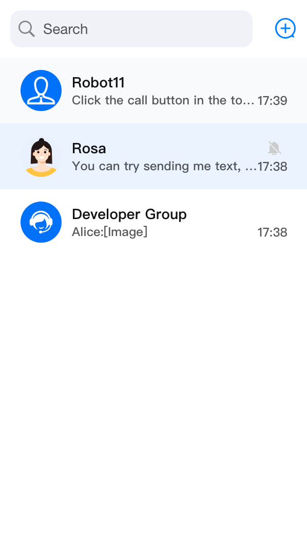 | 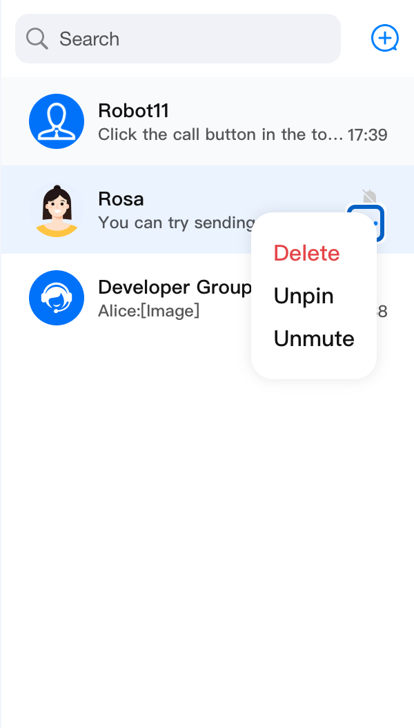 | 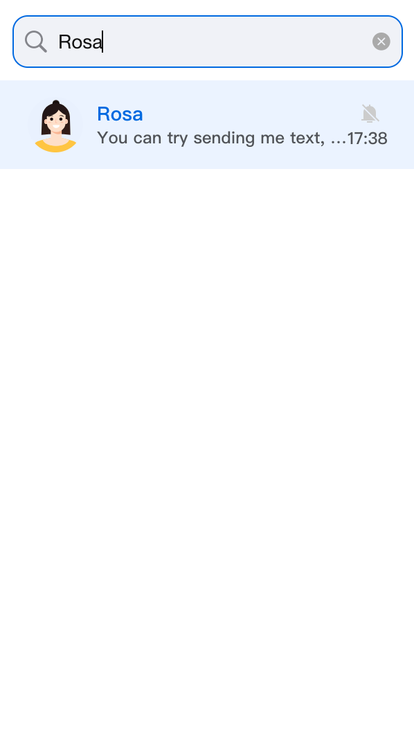 | 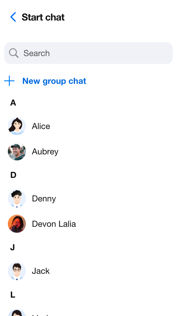 |
Component Structure
The
ConversationList component includes the following:ConversationSearch - Conversation searchConversationList UI - Conversation list containerConversationPreview - Displays information for a single conversationConversationActions - Actions for an individual conversation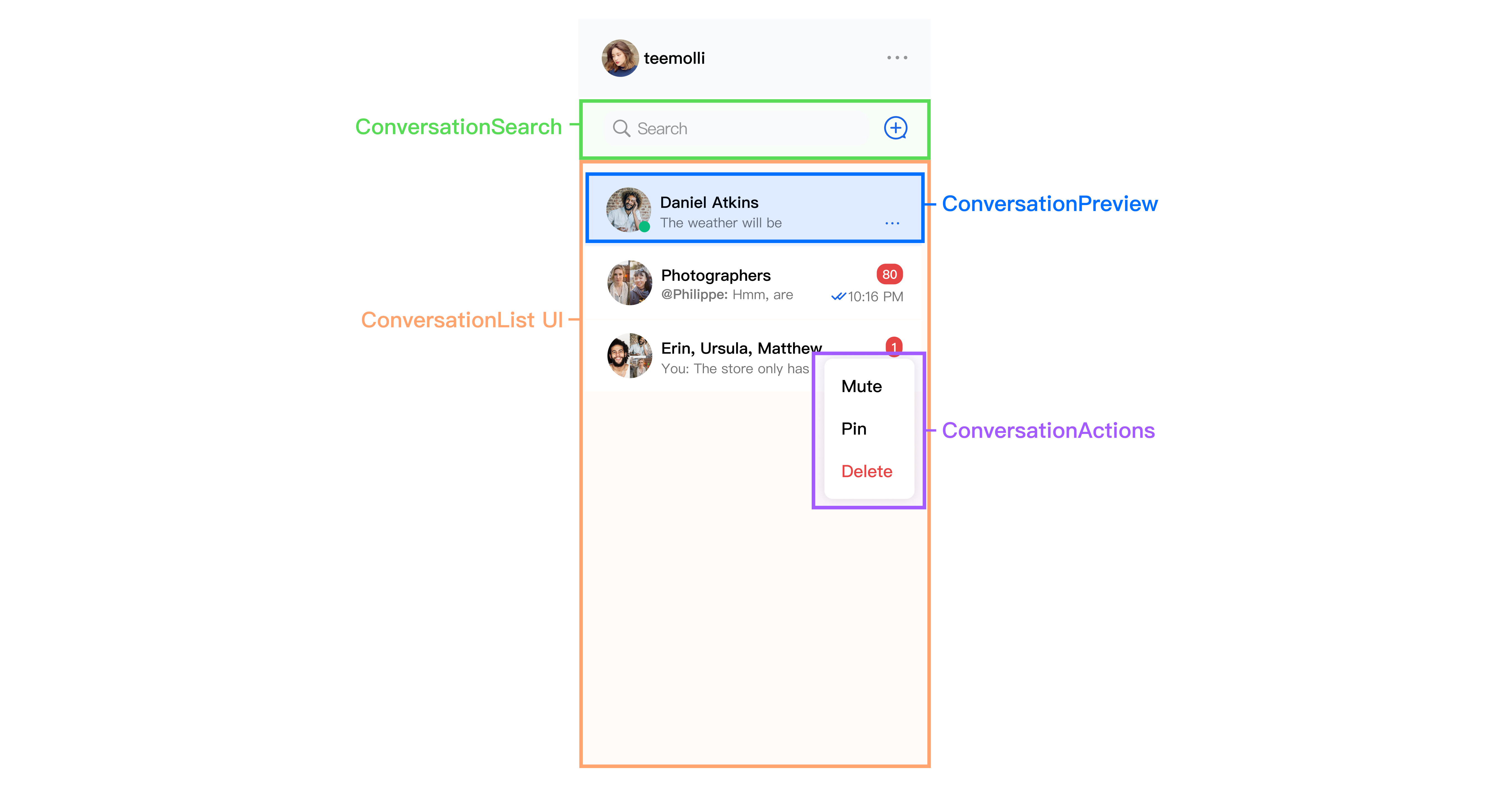
Basic Usage
The
ConversationList component does not require any mandatory props. To use ConversationList, add the following code:import { UIKitProvider, ConversationList } from '@tencentcloud/chat-uikit-react';const App = () => {return (<UIKitProvider><ConversationList /></UIKitProvider>);};
Customizing the Component
ConversationList offers a comprehensive props interface for customizing functionality, UI, modules, and more.You can replace multiple subcomponents within
ConversationList, including Header, List, ConversationPreview, ConversationCreate, ConversationSearch, ConversationActions, Avatar, and Placeholder. You can also extend and customize these default subcomponents as needed.Basic Feature Toggles
Control the display of conversation search, conversation creation, and conversation actions in
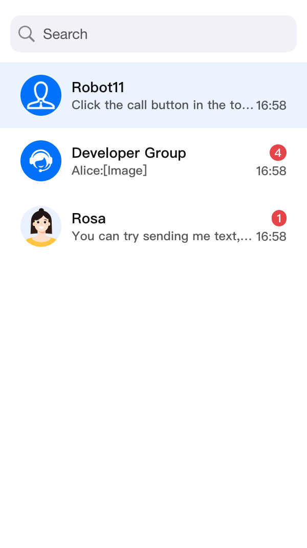
ConversationList by setting the enableSearch, enableCreate, and enableActions parameters.<ConversationList enableSearch={false} />
<ConversationList enableCreate={false} />
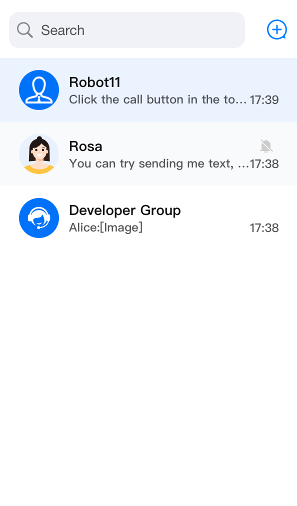
<ConversationList enableActions={false} />
enableSearch={false} | enableCreate={false} | enableActions={false} |
 |  |  |
Data Filtering and Sorting
The
ConversationList component provides filterConversation and sortConversation properties to filter and sort conversation list data.Filter Conversations
To filter conversation list data, pass a filter function to the
filterConversation property. This function receives the conversation list as a parameter and returns a new list containing only conversations that meet your criteria.The following example uses the
filterConversation property to display only conversations with unread messages:import { ConversationList } from '@tencentcloud/chat-uikit-react';import type { ConversationInfo } from '@tencentcloud/chat-uikit-react';<ConversationListfilter={(conversationList: ConversationInfo[]) =>conversationList.filter(conversation => conversation.unreadCount > 0)}/>
Sort Conversations
To sort conversation list data, pass a sorting function to the
sortConversation property. This function receives the conversation list as a parameter and returns a new list sorted according to your requirements.The following example uses the
sortConversation property to sort conversations by latest message time in descending order:import { ConversationList } from '@tencentcloud/chat-uikit-react';import type { ConversationInfo } from '@tencentcloud/chat-uikit-react';<ConversationListsort={(conversationList: ConversationInfo[]) =>conversationList.sort((a, b) => {const timeA = a.lastMessage?.timestamp?.getTime() || 0;const timeB = b.lastMessage?.timestamp?.getTime() || 0;return timeB - timeA;},)}/>
By using the
filter and sort properties, you can efficiently filter and sort conversation list data to suit your needs.Custom actionsConfig
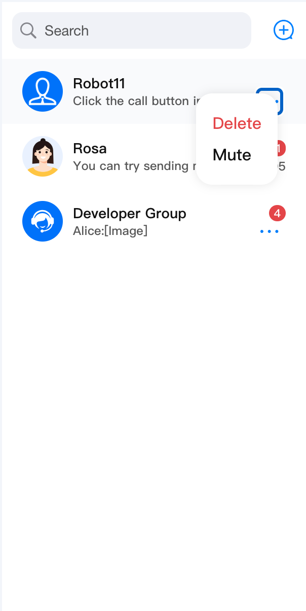
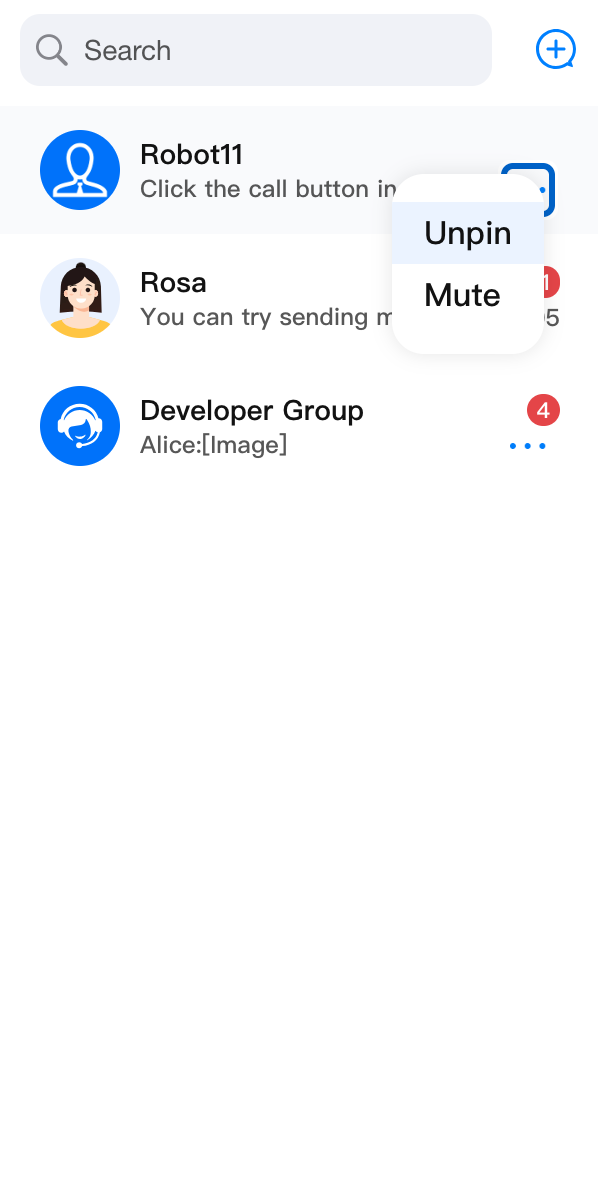
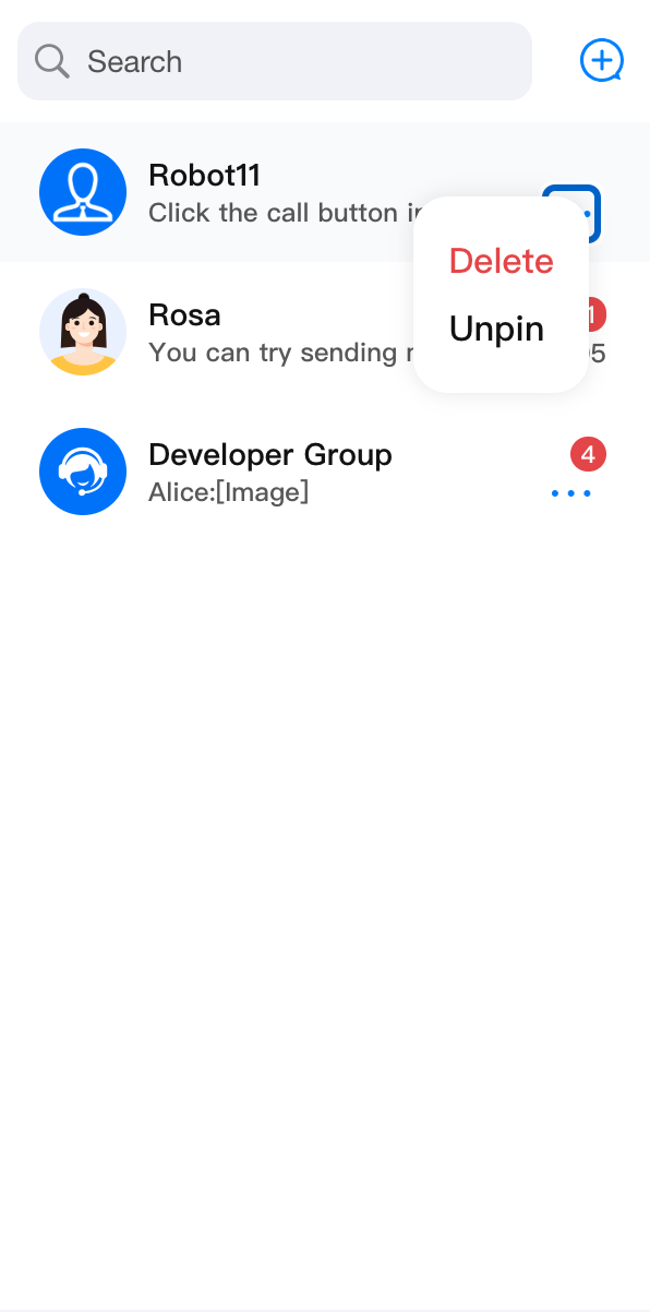
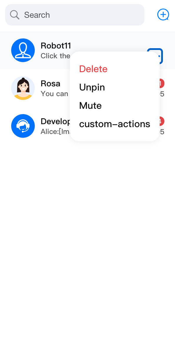
Use actionsConfig to control the basic functionality of ConversationActions. For additional customization, refer to the ConversationActions section.
import { ConversationList } from '@tencentcloud/chat-uikit-react';import type { ConversationInfo } from '@tencentcloud/chat-uikit-react';<ConversationListactionsConfig={{enablePin: false,onConversationDelete: (conversation: ConversationInfo) => { console.log('Delete conversation success'); },customConversationActions: {'custom-actions-1': {label: 'custom-actions',onClick: (conversation: ConversationInfo) => { console.log(conversation); },},},}}/>
enablePin: false | enableDelete: false | enableMute: false | customConversationActions |
 |  |  |  |
Custom Placeholder
Customize the list display for different states by passing
PlaceholderEmptyList, PlaceholderLoading, and PlaceholderLoadError.The following example customizes the
PlaceholderLoading element:import { ConversationList } from '@tencentcloud/chat-uikit-react';<ConversationListPlaceholderEmptyList={<div>Empty List!!!</div>}/>
Custom Header
ConversationListHeader renders the Header section of the ConversationList. By default, it wraps and displays ConversationSearch and ConversationCreate. You can customize it by passing left, right, and other properties, or by replacing the entire component.Props
Prop Name | Type | Default | Description |
children | ReactNode | - | Custom center component for the conversation list header. When used in ` , and ` are passed in by default. |
left | ReactElement | - | Custom component for the left side of the conversation list header. |
right | ReactElement | - | Custom component for the right side of the conversation list header. |
className | String | - | Custom CSS class name for the root element. |
style | React.CSSProperties | - | Custom style for the root element. |
Basic Customization
The following example adds a new feature button to the right side of the Header component.
import {ConversationList,ConversationListHeader,} from '@tencentcloud/chat-uikit-react';const CustomConversationListHeader = (props) => {const CustomIcon = <div>Custom Icon</div>;return (<ConversationListHeader {...props} right={CustomIcon} />);};<ConversationList Header={CustomConversationListHeader} />
Advanced Customization
The following example implements conversation grouping, categorizing by All, Unread, C2C, and Group. Clicking each group button applies a different filter.
Before | After |
 | 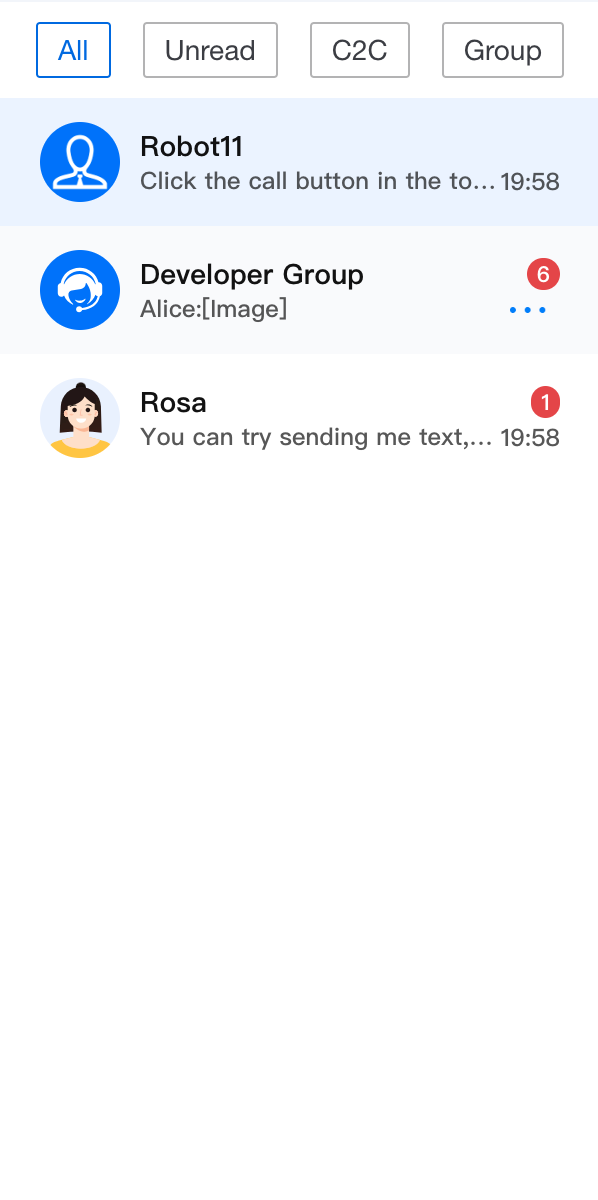 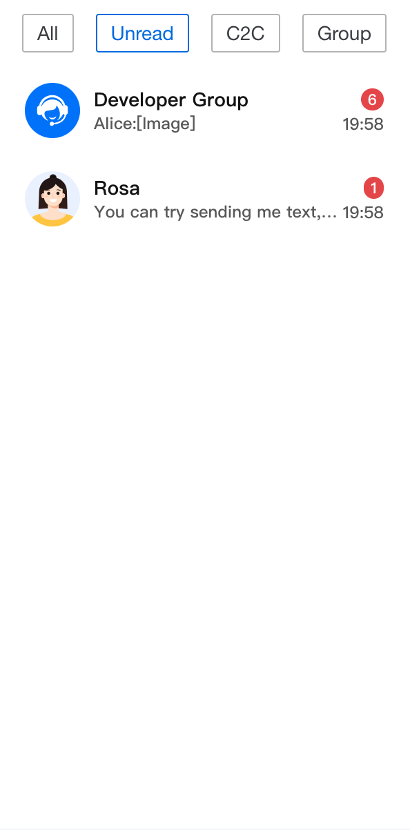 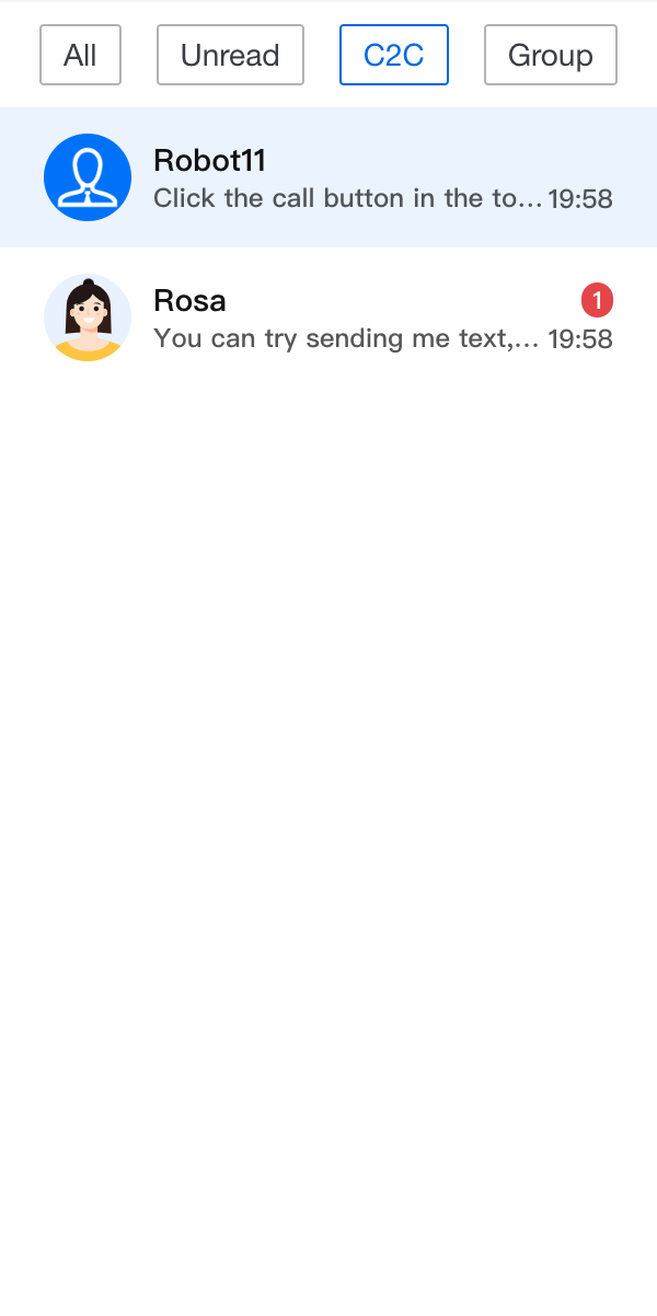 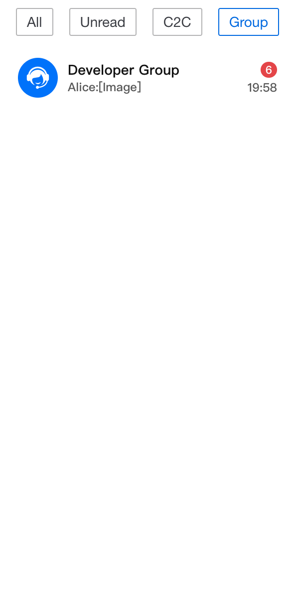 |
import { useState } from 'react';import { ConversationList, UIKitProvider, ConversationInfo } from '@tencentcloud/chat-uikit-react';const conversationGroupFilter: Record<string, (conversationList: ConversationInfo[]) => ConversationInfo[]> = {all: (conversationList: ConversationInfo[]) => conversationList,unread: (conversationList: ConversationInfo[]) => conversationList?.filter((item: ConversationInfo) => item.unreadCount > 0),c2c: (conversationList: ConversationInfo[]) => conversationList?.filter((item: ConversationInfo) => item.type === ConversationType.C2C),group: (conversationList: ConversationInfo[]) => conversationList?.filter((item: ConversationInfo) => item.type === ConversationType.Group),};const App = () => {const [currentFilter, setCurrentFilter] = useState<string>('all');const CustomConversationListHeader = (props: IConversationListHeaderProps) => {return (<div className="conversation-group-wrapper"><button className={currentFilter === 'all' ? 'btn-active' : 'btn-default'} onClick={() => setCurrentFilter('all')}>All</button><button className={currentFilter === 'unread' ? 'btn-active' : 'btn-default'} onClick={() => setCurrentFilter('unread')}>Unread</button><button className={currentFilter === 'c2c' ? 'btn-active' : 'btn-default'} onClick={() => setCurrentFilter('c2c')}>C2C</button><button className={currentFilter === 'group' ? 'btn-active' : 'btn-default'} onClick={() => setCurrentFilter('group')}>Group</button></div>);};return (<UIKitProvider><ConversationListstyle={{ maxWidth: '300px', height: '600px' }}Header={CustomConversationListHeader}filter={conversationGroupFilter[currentFilter]}/></UIKitProvider>);};
.conversation-group-wrapper {display: flex;justify-content: space-around;align-items: center;margin: 10px;font-size: 14px;.btn-default{display: flex;padding: 5px 10px;border: 1px solid #b3b3b4;color: #3b3d43;background-color: transparent;border-radius: 2px;}.btn-active{display: flex;padding: 5px 10px;border: 1px solid #1c66e5;color: #1c66e5;background-color: transparent;border-radius: 2px;}}
Custom List
ConversationListContent renders the main list section of the ConversationList.By default, it displays the current conversation list data (
filteredAndSortedConversationList) calculated in Context.Props
Prop Name | Type | Default | Description |
children | ReactNode | - | Custom component for the conversation list content area. When used in , the filteredAndSortedConversationList is passed in and iterated as a list of `` components. |
empty | Boolean | false | Flag for empty conversation list. When used in ` , it checks if filteredAndSortedConversationList.length === 0` and passes this in. |
loading | Boolean | false | Flag for conversation list loading state. When used in ` , it uses useConversationList() to get isLoading` and passes it in. |
error | Boolean | false | Flag for conversation list load error. When used in ` , it uses useConversationList() to get isLoadError` and passes it in. |
PlaceholderEmptyList | ReactNode | `` | Custom placeholder element when the conversation list is empty. |
PlaceholderLoading | ReactNode | `` | Custom placeholder element when the conversation list is loading. |
PlaceholderLoadError | ReactNode | `` | Custom placeholder element when the conversation list fails to load. |
className | String | - | Custom CSS class name for the root element. |
style | React.CSSProperties | - | Custom style for the root element. |
Basic Customization
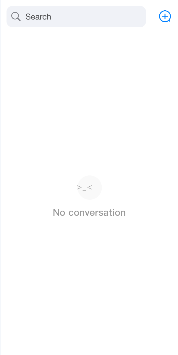
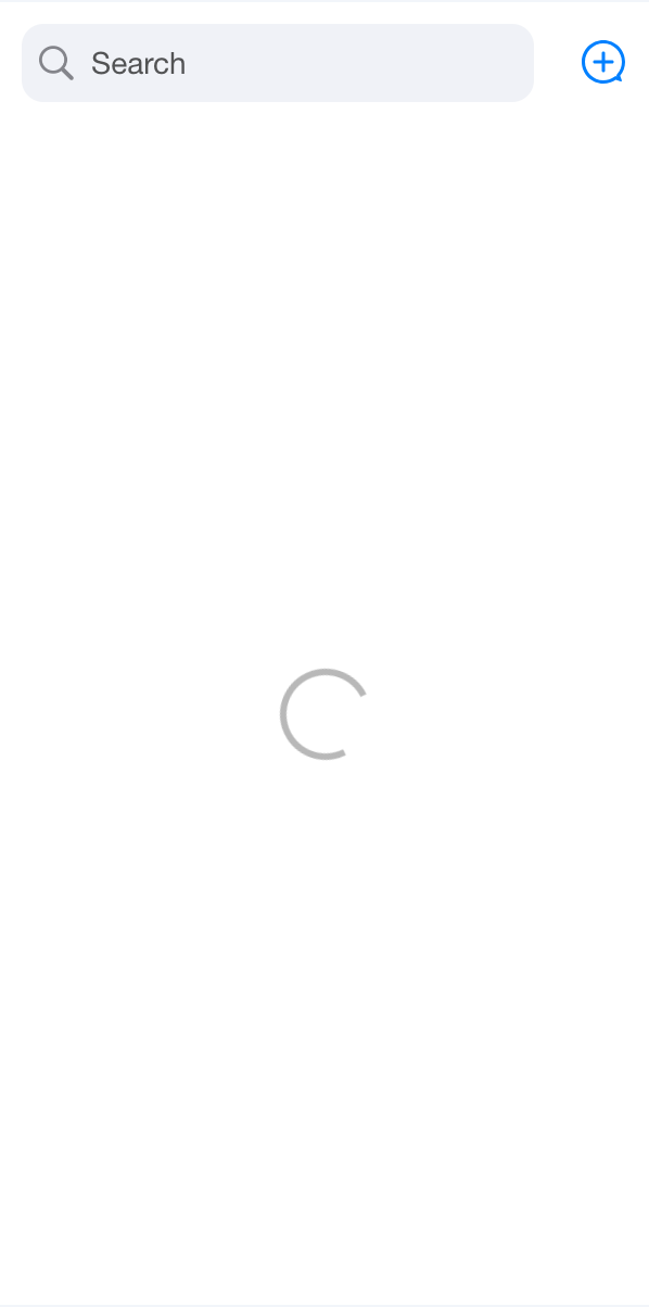
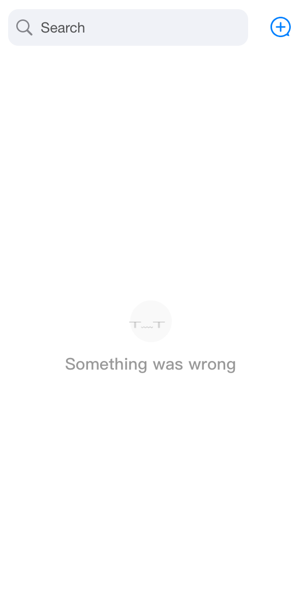
The
List component manages different UI states as shown below. State transitions are handled internally within ConversationList.You can also control the component state by passing custom
empty, loading, or error props.import { ConversationList, ConversationListContent } from '@tencentcloud/chat-uikit-react';const CustomConversationListContent = (props) => {return <ConversationListContent {...props} loading={true} />;};<ConversationList List={CustomConversationListContent} />
default | empty={true} | loading={true} | error={true} |
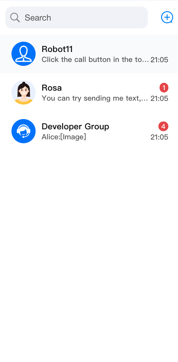 |  |  |  |
Custom ConversationPreview
For details, see the ConversationPreview section.
<ConversationList ConversationPreview={CustomConversationPreview} />
Custom ConversationActions
For details, see the ConversationActions section.
<ConversationList ConversationActions={CustomConversationActions} />
Custom ConversationSearch
For details, see the ConversationSearch section.
<ConversationList ConversationSearch={CustomConversationSearch} />
Custom ConversationCreate
<ConversationList ConversationCreate={CustomConversationCreate} />
Custom Avatar
<ConversationList Avatar={CustomAvatar} />
APIs/Props
Prop Name | Type | Default | Description |
enableSearch | Boolean | true | Controls whether the conversation search feature is displayed. |
enableCreate | Boolean | true | Controls whether the conversation creation feature is displayed. |
enableActions | Boolean | true | Controls whether conversation actions are displayed. |
actionsConfig | ConversationActionsConfig | - | Used to customize conversation action configurations. |
Header | ReactElement | Header | Custom Header component. |
List | ReactElement | List | Custom conversation list component. |
Preview | ReactElement | ConversationPreview | Custom conversation preview component. |
ConversationCreate | ReactElement | ConversationCreate | Custom conversation creation component. |
ConversationSearch | ReactElement | ConversationSearch | Custom conversation search component. |
ConversationActions | ReactElement | ConversationActions | Custom conversation actions component. |
Avatar | ReactElement | Avatar | Custom avatar component. |
PlaceholderEmptyList | ReactNode | - | Custom placeholder element when the conversation list is empty. |
PlaceholderLoading | ReactNode | - | Custom placeholder element when the conversation list is loading. |
PlaceholderLoadError | ReactNode | - | Custom placeholder element when the conversation list fails to load. |
filter | (conversationList: ConversationInfo[]) => ConversationInfo[] | - | Function used to filter the conversation list. |
sort | (conversationList: ConversationInfo[]) => ConversationInfo[] | - | Function used to sort the conversation list. |
onConversationSelect | (conversation: ConversationInfo) => void; | - | Callback function triggered when a conversation is clicked. The parameter is the clicked conversation object. |
onBeforeCreateConversation | (params: CreateParams) => CreateParams; | - | Custom operation executed before creating a conversation. The parameter is the required parameters for creating a conversation. |
onConversationCreate | (conversation: ConversationInfo) => void; | - | Callback function after conversation creation. The parameter is the created conversation object. |
className | String | - | Custom CSS class name for the root element. |
style | React.CSSProperties | - | Custom style for the root element. |
Bantuan dan Dukungan
Apakah halaman ini membantu?
Anda juga dapat Menghubungi Penjualan atau Mengirimkan Tiket untuk meminta bantuan.
masukan