Release Notes
Product Announcement
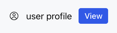
<ListView><ListViewItem gap="16px" align="center"><Icon name="profile" size="lg" /><Text value="user profile" /><Button label="view" size="sm" /></ListViewItem></ListView>
Attribute Name | Type | Description | Default Value |
children ★ | ListViewItem[] | List Item Array | - |
limit | number | "auto" | Display Quantity Limit | - |
status | WidgetStatus | Status Configuration | - |
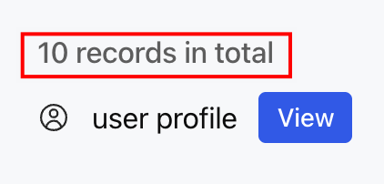
<ListView status="10 records in total"><ListViewItem gap="16px" align="center"><Icon name="profile" size="lg" /><Text value="user profile" /><Button label="view" size="sm" /></ListViewItem></ListView>
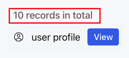
<ListView status={{ text: "10 records in total" }}><ListViewItem gap="16px" align="center"><Icon name="profile" size="lg" /><Text value="user profile" /><Button label="view" size="sm" /></ListViewItem></ListView>
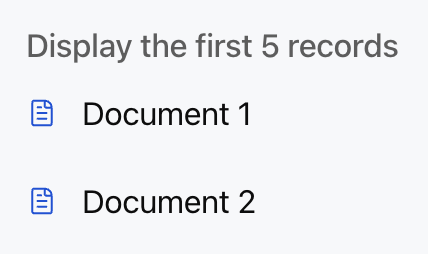
icon and favicon fields, the current implementation only displays text content and does not support icon display.<ListView limit={5} status="Display the first 5 records"><ListViewItemgap="12px"align="center"onClickAction={{ type: "select_item", payload: { id: "1" } }}><Icon name="document" color="#0052D9" /><Text value="Document 1" /></ListViewItem><ListViewItem gap="12px" align="center"><Icon name="document" color="#0052D9" /><Text value="Document 2" /></ListViewItem></ListView>
Apakah halaman ini membantu?
Anda juga dapat Menghubungi Penjualan atau Mengirimkan Tiket untuk meminta bantuan.
masukan