Release Notes
Product Announcement
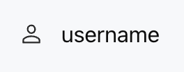
<ListViewItem gap="16px" align="center"><Icon name="user" size="lg" /><Text value="username" /></ListViewItem>
Attribute Name | Type | Description | Default Value |
children ★ | ChatKitComponent[] | Component List | - |
onClickAction | ActionConfig | Action triggered when clicking the entire list item | - |
gap | number | string | child element spacing | - |
align | Alignment | vertical alignment | "start" |
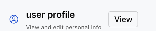
"start" - top alignment"center" - center alignment"end" - bottom alignment"baseline" - baseline alignment"stretch" - stretch alignmentonClickAction is configured:<ListView><ListViewItemgap="16px"align="center"onClickAction={{type: "sys.go_to_url",payload: { url: "/profile" }}}><Icon name="profile" size="lg" color="#0052D9" /><Col gap="4px" flex={1}><Text value="user profile" size="md" weight="semibold" /><Caption value="View and edit personal info" size="sm" /></Col><Button label="View" variant="outline" size="sm" /></ListViewItem></ListView>
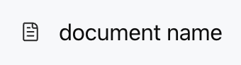
<ListViewItem gap="12px" align="center"><Icon name="document" /><Text value="document name" /></ListViewItem>
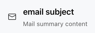
<ListViewItem gap="16px" align="center"><Icon name="mail" size="lg" /><Col gap="4px" flex={1}><Text value="email subject" weight="semibold" /><Caption value="Mail summary content" /></Col></ListViewItem>
<ListViewItem gap="16px" align="center"><Image src="https://cdn.xiaowei.qq.com/webim/assets/static/widget/lib-v1.0.0/img/self_introduction.png" size="48px" radius="full" /><Col gap="4px" flex={1}><Text value="Julian" weight="semibold" /><Caption value="Product manager" /></Col><Button label="Follow" size="sm" /></ListViewItem>

Apakah halaman ini membantu?
Anda juga dapat Menghubungi Penjualan atau Mengirimkan Tiket untuk meminta bantuan.
masukan