Android(Compose)
Download
聚焦模式
字号
TUIKit Compose 提供了强大的外观定制能力,支持自定义应用的主题模式(浅色/深色/跟随系统)和主题色。通过简单的配置,开发者可以轻松实现应用级别的主题切换和品牌色定制。
以消息列表为例,自定义主题模式和主题色的效果如下图所示:
浅色 + 默认颜色 | 浅色 + 橘黄色 | 深色 + 默认颜色 | 深色 + 绿色主题 |
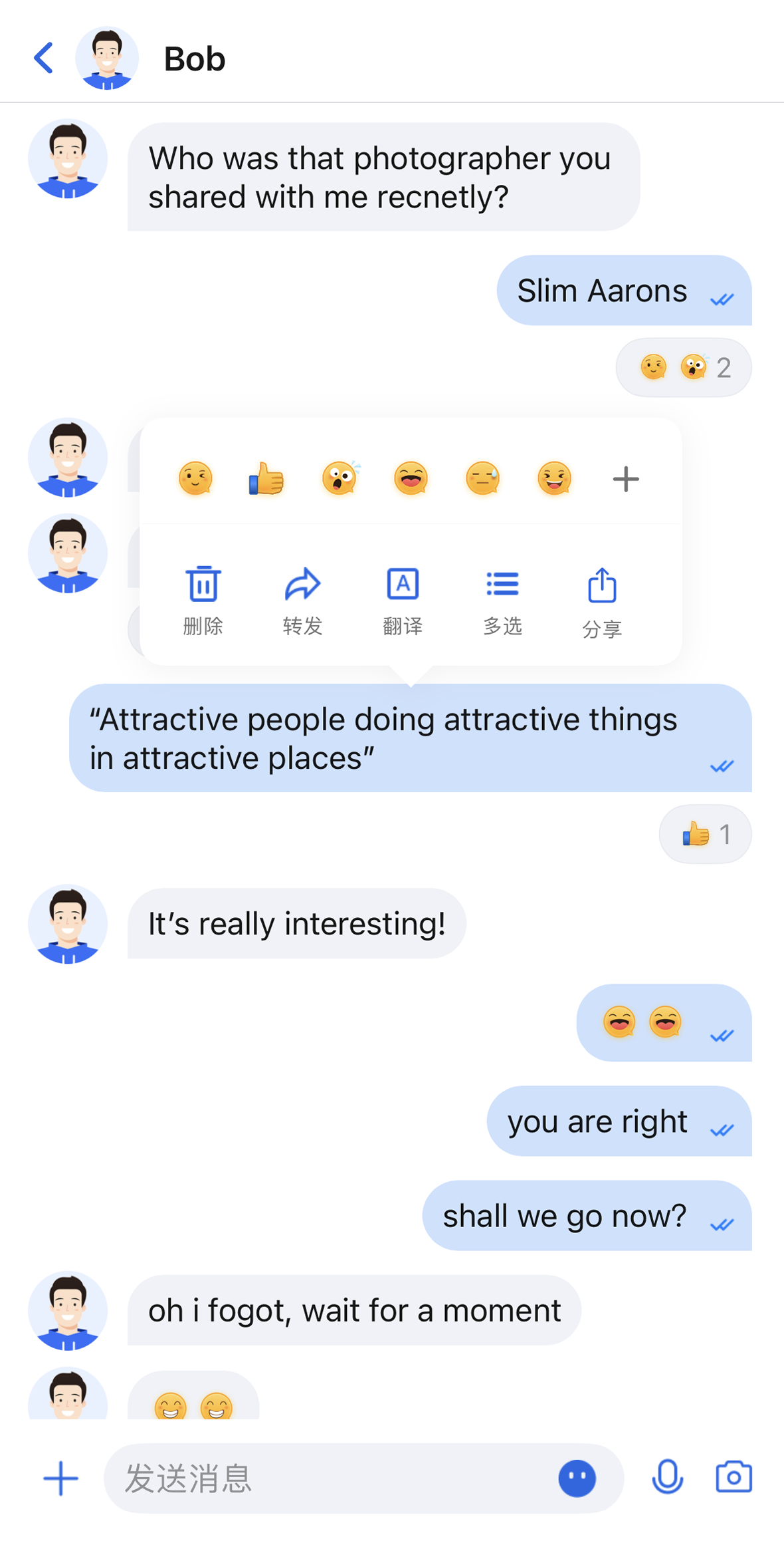 | 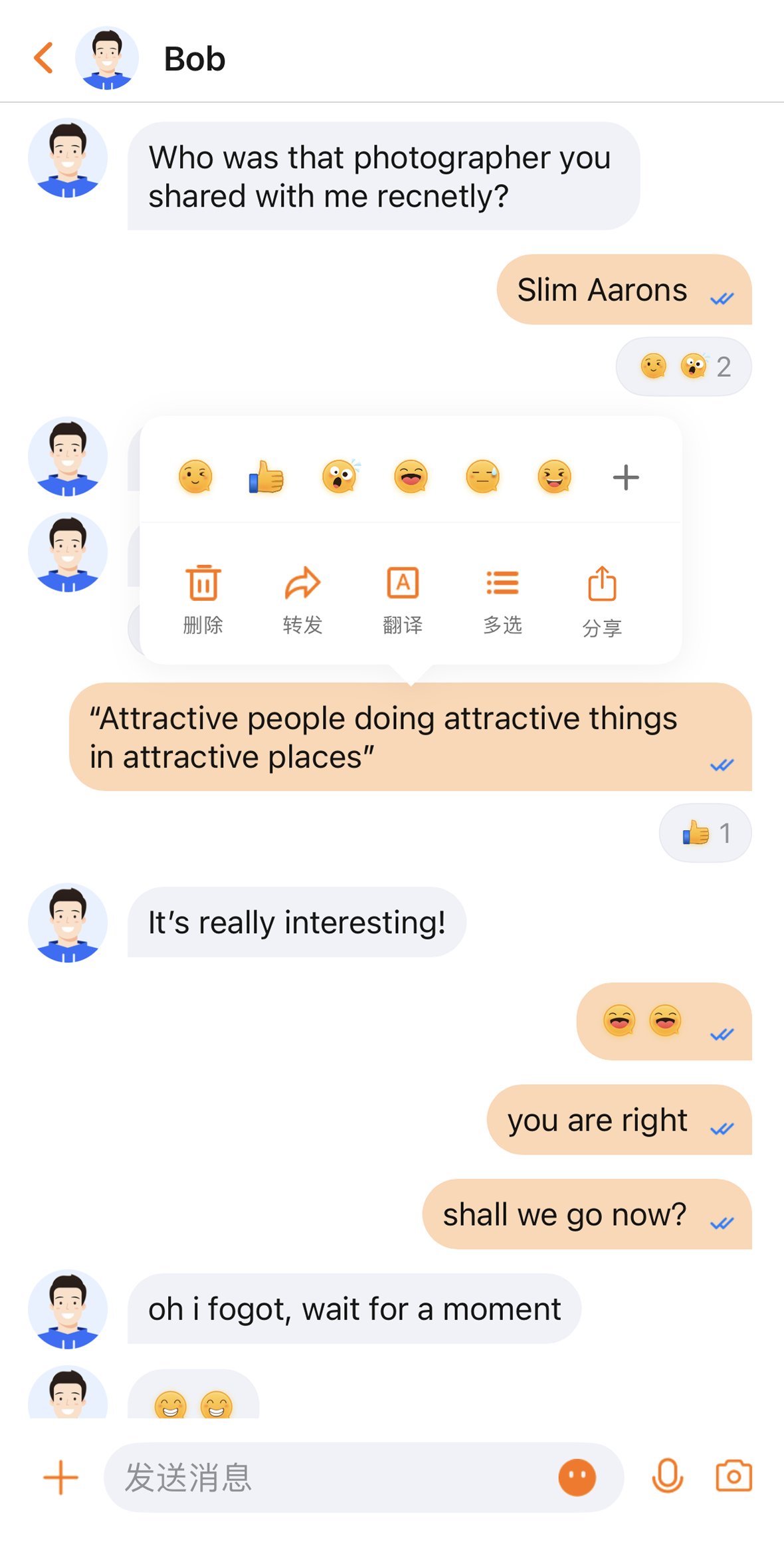 | 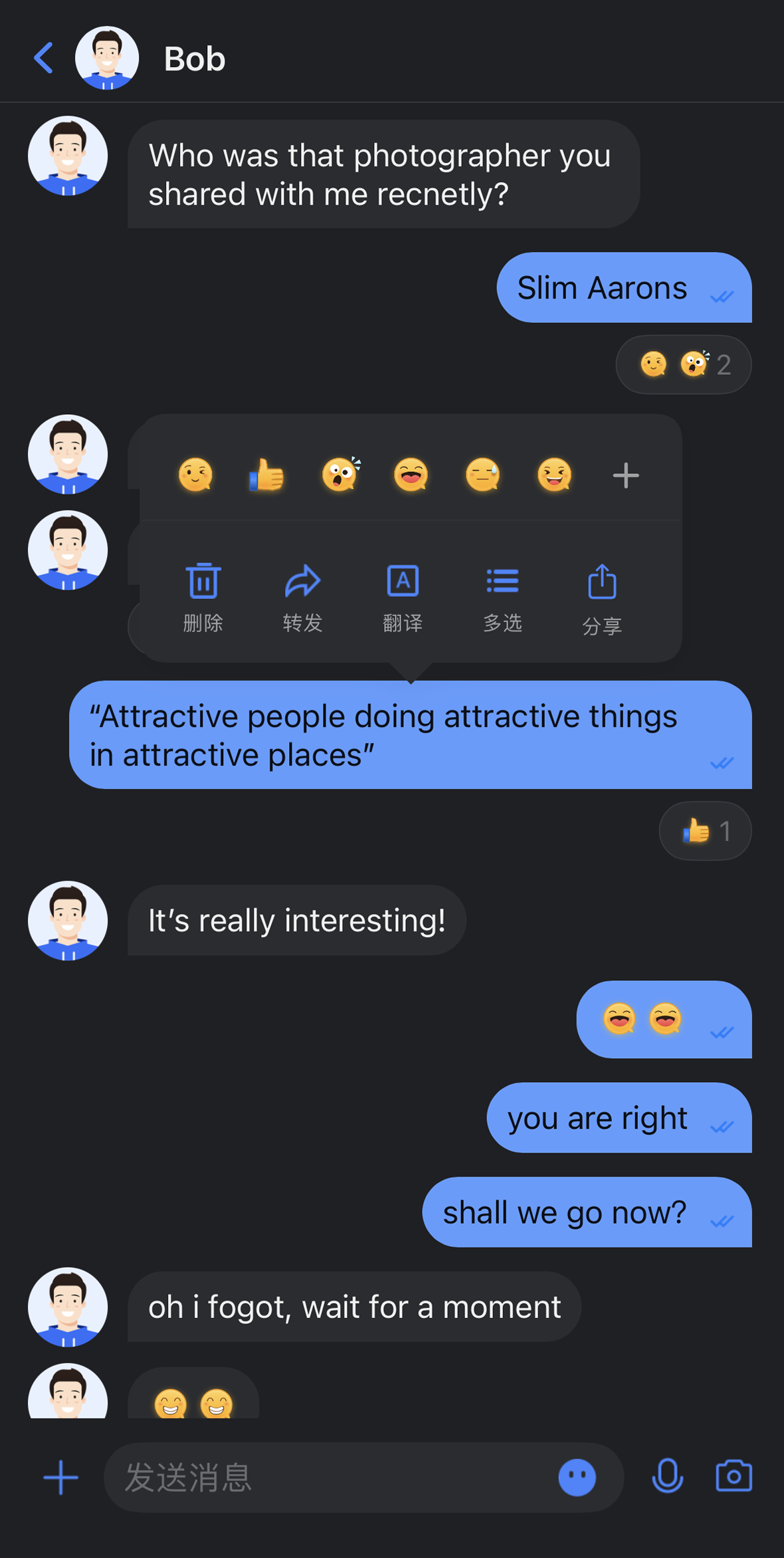 | 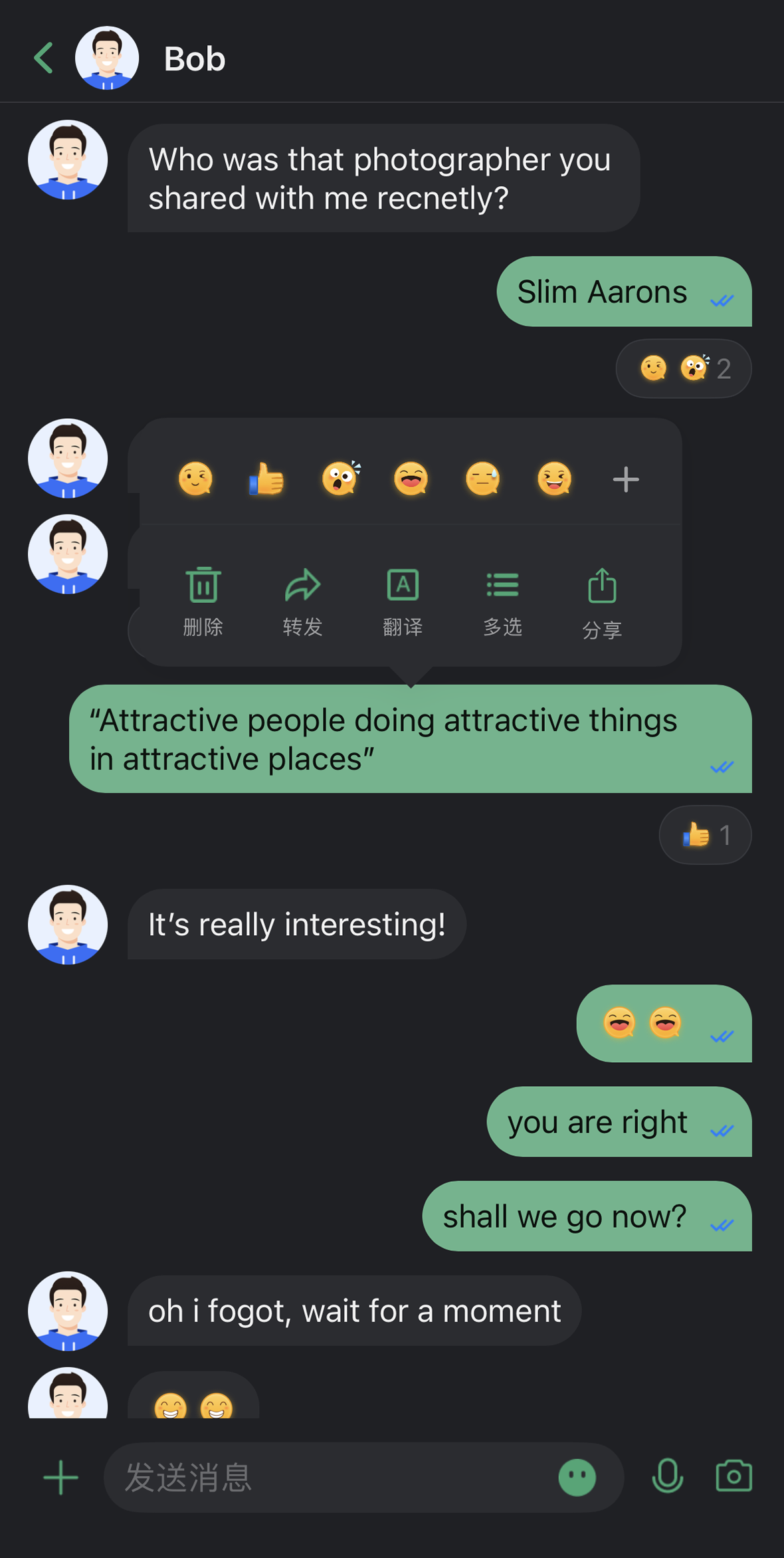 |
核心能力
模式切换
浅色模式(Light):适合日间使用的明亮界面。
深色模式(Dark):适合夜间使用的暗色界面。
跟随系统(System):自动跟随系统外观设置。
主题色定制
预设主题色:提供蓝、绿、红、橙等标准色。
自定义主题色:支持任意 Hex 格式颜色。
智能色板生成:自动生成 10 个色阶的完整色板。
清除自定义:一键恢复默认主题色。
API 说明
以上功能基于
ThemeState 提供的一组简洁的 API,用于主题配置和信息查询。设置主题模式
方法 | 参数 | 返回值 | 说明 |
setThemeMode | ThemeMode | Unit | 设置显示模式,自动保存并刷新。 ThemeMode.SYSTEM:跟随系统外观。ThemeMode.LIGHT:强制使用浅色模式。ThemeMode.DARK:强制使用深色模式。 |
设置主题色
方法 | 参数 | 返回值 | 说明 |
setPrimaryColor | String | Unit | 设置主题色,需要 Hex 格式(例如 "#1C66E5")。 |
clearPrimaryColor | 无 | Unit | 清除自定义主题色,恢复默认蓝色。 |
说明:
调用
setThemeMode 或 setPrimaryColor 后,配置会自动保存到持久化存储,无需手动保存。下次启动应用时会自动加载。修改主题配置时会自动清除缓存,确保色彩方案实时更新。开发者无需关心缓存管理。
使用设置 API 时需避免频繁切换主题(例如在循环中调用)。
查询 ThemeState 信息
通过以下只读属性可以查询当前的主题配置状态和信息:
属性 | 类型 | 说明 |
currentMode | ThemeMode | 当前主题模式。 |
currentPrimaryColor | String? | 当前主题色(Hex 格式)。 |
hasCustomPrimaryColor | Boolean | 是否设置了自定义主题色。 |
isDarkMode | Boolean | 当前是否为深色模式。 |
使用方式
本章节介绍如何在您的应用中集成和使用主题、主题色定制功能,按照从简单到复杂的顺序提供三种方式。
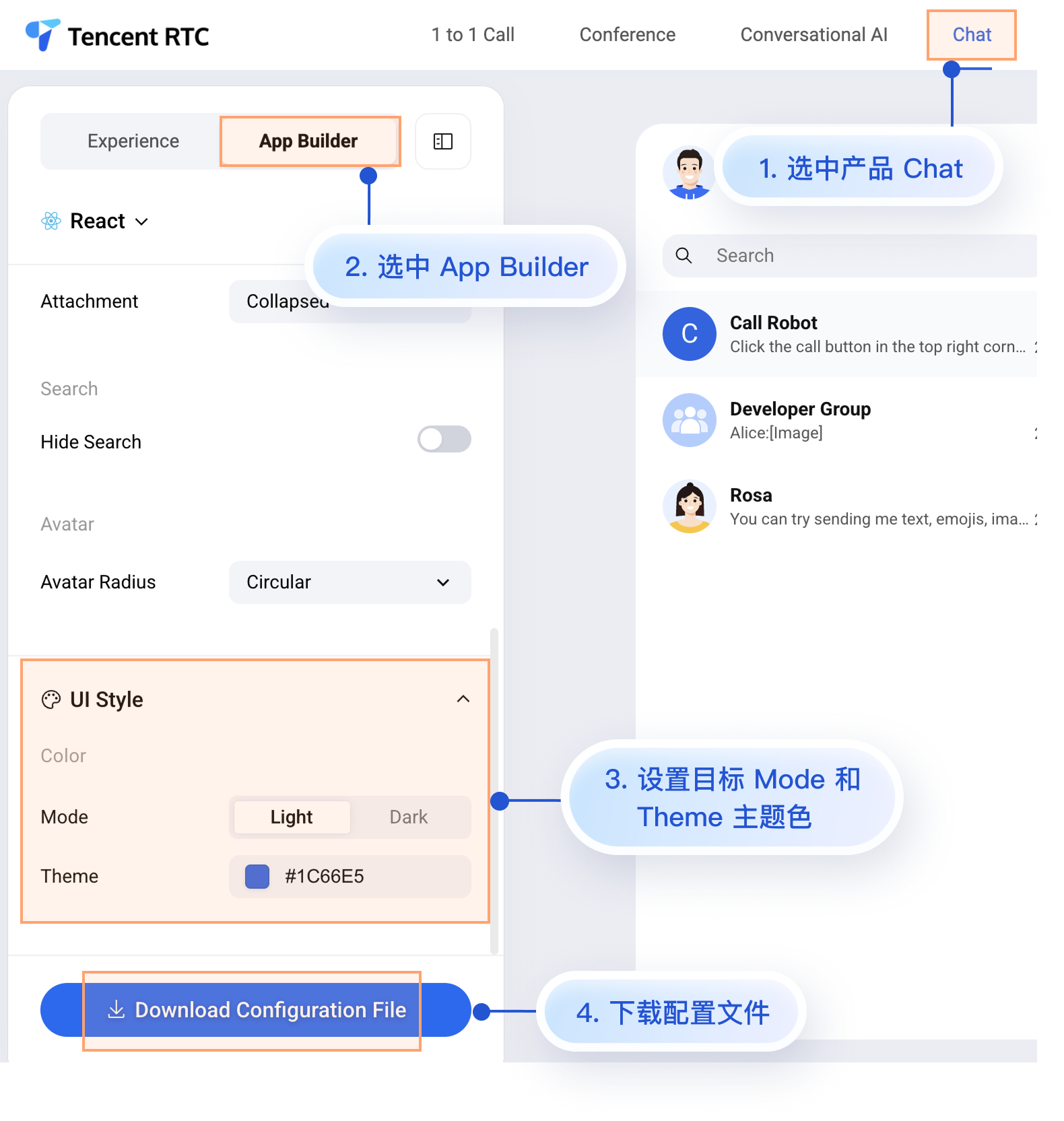
方式一:使用 AppBuilder 配置(推荐)
AppBuilder 是一个便捷式功能及 UI 自定义配置工具,通过 JSON 配置文件统一管理,适用于 Web + Native 双端应用需要保持统一外观的场景。
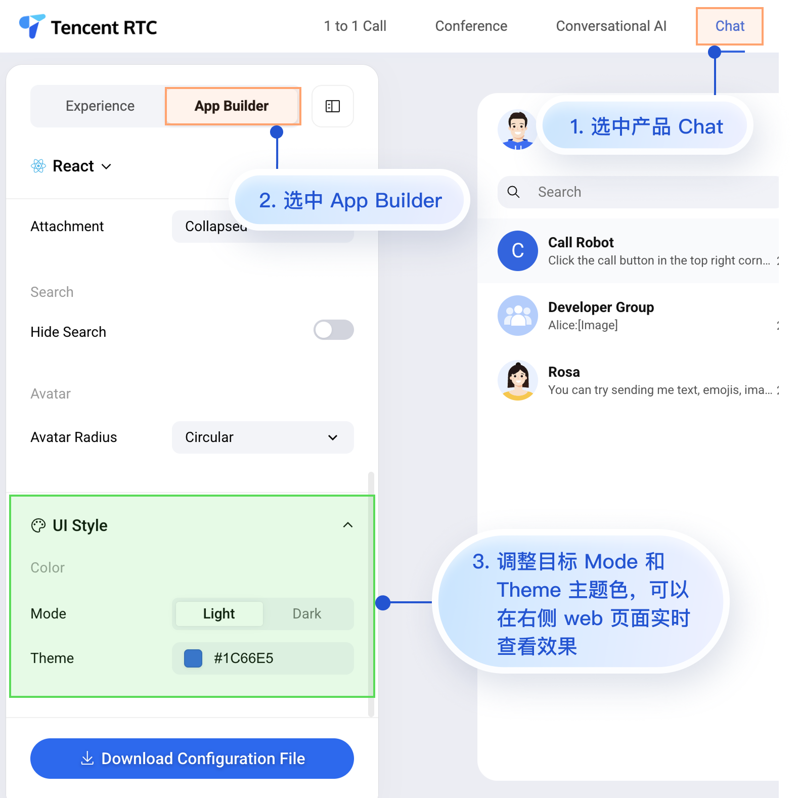
虽然 Chat Web 体验馆上暂时无法实时观看移动端的配置效果,但移动端已经预先支持了 AppBuilder 的配置能力。
接下来为您介绍在 Web 体验馆设置 AppBuilder 后,如何在移动端项目中应用该自定义配置。操作步骤比较简单,只有 2 步:
1. 下载配置文件。
2. 将配置文件 appConfig.json 拖入您的 Android 项目中。
1. 下载配置文件
appConfig.json文件内容如下所示,与 AppBuilder 页面的配置项一一对应,与定义外观相关的配置是 theme及其子字段:{"theme": {"mode": "light", // 主题模式,light-浅色模式,dark-深色模式,system-自动跟随系统"primaryColor": "#E65100" // 主色调,16 进制颜色值},"messageList": {"alignment": "two-sided","enableReadReceipt": false,"messageActionList": ["copy","recall","quote","forward","delete"]},"conversationList": {"enableCreateConversation": true,"conversationActionList": ["delete","mute","pin","markUnread"]},"messageInput": {"hideSendButton": false,"attachmentPickerMode": "collapsed"},"search": {"hideSearch": false},"avatar": {"shape": "circular"}}
配置选项说明
参数说明 | 类型 | 可选值 | 说明 |
mode | String | "system"、"light"、"dark" | 主题模式 |
primaryColor | String | Hex 颜色值,例如 "#0ABF77" | 主题色 |
2. 将配置文件拖入项目中
将 appConfig.json 拖入您的项目中。以 Github 开源 Demo TUIKit Android Compose 项目为例,appConfig.json 位于 demo/app 的 assets 文件夹下:
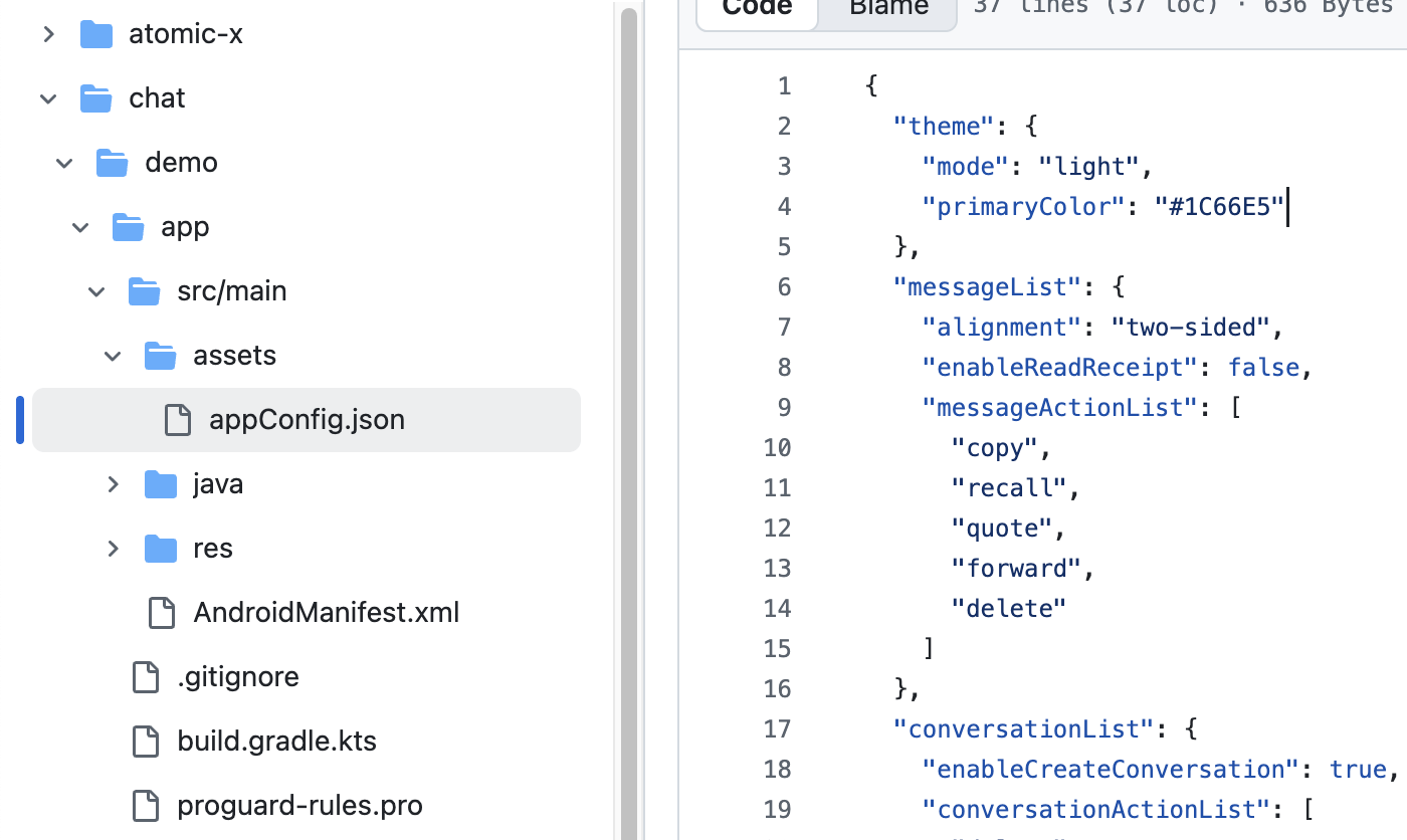
至此,无需编写额外代码,启动 App 后,TUIKit Compose 组件的模式和主题色会自动显示成您在 appConfig.json 中设置的值。
方式二:代码设置主题模式
您可以通过 API
setThemeMode 直接设置主题模式。示例代码如下所示:val themeState = ThemeState.sharedColumn {Button(onClick = {themeState.setThemeMode(ThemeMode.SYSTEM)}) { Text(text = "跟随系统") }Button(onClick = {themeState.setThemeMode(ThemeMode.LIGHT)}) { Text(text = "浅色模式") }Button(onClick = {themeState.setThemeMode(ThemeMode.DARK)}) { Text(text = "深色模式") }}
方式三:代码设置主题色
您可以通过 API
setPrimaryColor 设置主题色,只需要传入一个主颜色值,整个 TUIKit Compose 组件会自动根据该主颜色值,为不同的组件适配出一组相同色系里的相似色值渲染界面,您无需再手动适配界面 UI。示例代码如下所示:Column {var text: String by remember { mutableStateOf("#1C66E5") }fun isValidHexColor(): Boolean {return text.matches(Regex("^#[0-9A-Fa-f]{6}$"))}BasicTextField(value = text,onValueChange = { text = it },modifier = Modifier.fillMaxWidth().padding(16.dp))Button(enabled = isValidHexColor(),onClick = {themeState.setPrimaryColor(text)}) {Text("应用主题色")}}
使用建议:
对于大多数应用,推荐使用 JSON 配置文件的方式,简单可靠且支持多端统一。
在整个应用中统一使用
themeState.colors 中的颜色,确保主题切换时界面保持一致。常见问题
如何判断当前是否为深色模式?
if themeState.isDarkMode {// 当前是深色模式} else {// 当前是浅色模式}
可以设置透明度吗?
不支持。主题色只支持 6 位 Hex 格式(RGB),不支持 8 位格式(RGBA)。
如何恢复默认主题?
themeState.clearPrimaryColor() // 清除自定义主题色themeState.setThemeMode(ThemeMode.SYSTEM) // 恢复跟随系统
主题配置存储在哪里?
存储在应用的持久化存储中。应用卸载后会丢失,重新安装后恢复默认配置。
如何获取当前主题的完整配置?
val config = themeState.currentThemeprint("模式: ${config.mode}")print("主题色: ${config.primaryColor ?: "默认"}")
可以同时设置模式和主题色吗?
可以分别调用两个方法,系统会自动合并配置:
themeState.setThemeMode(ThemeMode.DARK)themeState.setPrimaryColor("#0ABF77")
文档反馈