React
Baixar
Modo Foco
Tamanho da Fonte
Overview
MessageInput is a fully featured input component for chat applications, providing all essential messaging functions such as text entry, emoji selection, file attachments, and a send button. The component is highly flexible, supporting configuration for input behavior, toolbar layout, component overrides, and slot-based extension. This allows you to customize the input experience to fit a wide range of chat scenarios.
Props
Field | Type | Default | Description |
boolean | true | Automatically focus the input box on mount | |
boolean | false | Disable the input component, including all actions | |
boolean | false | Hide the send button | |
string | '' | Placeholder text for the input box | |
string | undefined | Custom CSS class name for the root container | |
React.CSSProperties | undefined | Custom inline styles for the root container | |
'collapsed' | 'expanded' | 'collapsed' | Attachment picker display mode | |
MessageInputActions | ['EmojiPicker', 'AttachmentPicker'] | Toolbar action button configuration | |
(payload: SendMessagePayload) => OfflinePushInfo | undefined | undefined | Customize offline push parameters for outgoing messages | |
MessageInputSlots | undefined | Slot configuration object | |
JSX.Element | undefined | Custom text editor component | |
JSX.Element | undefined | Custom emoji picker component | |
JSX.Element | undefined | Custom attachment picker component | |
JSX.Element | undefined | Custom file picker component | |
JSX.Element | undefined | Custom image picker component | |
JSX.Element | undefined | Custom video picker component |
Property Details
autoFocus
Type:
booleanControls whether the input box is automatically focused when the component mounts. Default:
true.disabled
Type:
booleanDisables the entire input component, including text entry and all action buttons. Default:
false.hideSendButton
Type:
booleanDetermines whether the send button is displayed. Useful when you want to implement a custom send mechanism. Default:
false.placeholder
Type:
stringSets the placeholder text shown in the input box. Default: empty string.
className
Type:
stringApplies a custom CSS class name to the root container. Default:
undefined.style
Type:
React.CSSPropertiesApplies custom inline styles to the root container. Default:
undefined.attachmentPickerMode
Type:
'collapsed' | 'expanded'Sets the display mode for the attachment picker. Default:
'collapsed'.collapsed: Options are hidden by default and expand when clicked.expanded: All attachment options are visible by default.Note:
The default AttachmentPicker includes options for selecting files, images, and videos.
1. When
attachmentPickerMode is set to "collapsed", clicking the attachment picker opens a popup menu with file, image, and video selection.2. When
attachmentPickerMode is "expanded", all file, image, and video selection options are displayed side by side in the toolbar.actions
Type:
MessageInputActionsConfigures the set and order of action buttons in the input toolbar. Default:
['EmojiPicker', 'AttachmentPicker'].type BuiltInAction =| 'EmojiPicker'| 'ImagePicker'| 'FilePicker'| 'VideoPicker'| 'AttachmentPicker';type CustomAction = {key: string;label?: string | undefined;component?: React.ComponentType<any> | undefined;className?: string | undefined;style?: React.CSSProperties | undefined;iconSize?: number | undefined;};type MessageInputActions = Array<BuiltInAction | CustomAction>;
Example 1: Custom Toolbar Button Order
import { Chat, MessageInput } from '@tencentcloud/chat-uikit-react';function ChatWithCustomActions() {// Custom button order: File, Image, Video, Emojiconst customActions = ['FilePicker', 'ImagePicker', 'VideoPicker', 'EmojiPicker'];return (<Chat><MessageInput actions={customActions} /></Chat>);}
The result is shown below:

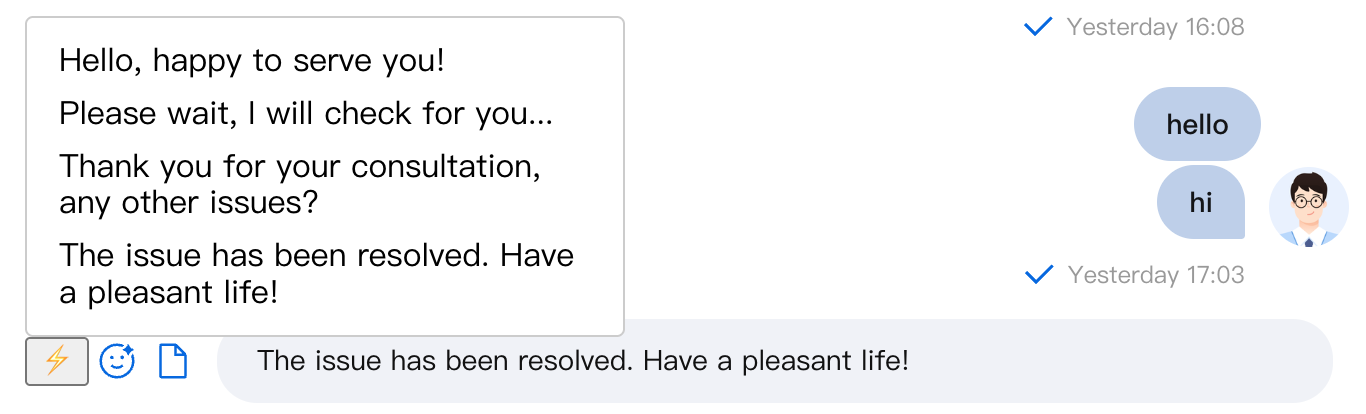
Example 2: Add a Custom Action Button for Quick Replies
import { Chat, MessageInput, useChatUIState } from '@tencentcloud/chat-uikit-react';// Quick Reply Componentfunction QuickReplyPicker() {const { insertInputContent } = useChatUIState();const quickReplies = ['Hello, glad to assist you!','Please wait a moment while I check for you...','Thank you for your inquiry. Any other questions?','Your issue has been resolved. Have a great day!'];const handleQuickReply = (text: string) => {insertInputContent(text);};return (<div style={{ position: 'relative' }}><button title="Quick Reply">⚡</button><div style={{position: 'absolute',bottom: '100%',left: 0,background: 'white',border: '1px solid #ccc',borderRadius: '4px',padding: '8px',minWidth: '200px'}}>{quickReplies.map((reply, index) => (<divkey={index}onClick={() => handleQuickReply(reply)}style={{padding: '4px 8px',cursor: 'pointer',borderRadius: '2px'}}>{reply}</div>))}</div></div>);}function CustomerServiceChat() {const actions = [{key: 'quickReply',label: 'Quick Reply',component: QuickReplyPicker},'EmojiPicker','FilePicker'];return (<Chat><MessageInput actions={actions} /></Chat>);}
The result is shown below:
setOfflinePushInfo
Type:
(payload: SendMessagePayload) => OfflinePushInfo | undefinedEnables you to customize offline push parameters dynamically based on the content of the outgoing message.
type SendMessagePayload = {type: 'textMessage';text: string;} | {type: 'customMessage';customData: string;description?: string;extensionInfo?: string;} | {type: 'imageMessage';file: File | HTMLInputElement;width?: number;height?: number;} | {type: 'audioMessage';file: File | HTMLInputElement;duration: number;} | {type: 'videoMessage';file: File | HTMLInputElement;duration: number;snapshotFile?: File | HTMLInputElement;snapshotWidth?: number;snapshotHeight?: number;} | {type: 'fileMessage';file: File | HTMLInputElement;} | {type: 'locationMessage';description: string;longitude: number;latitude: number;} | {type: 'faceMessage';index: number;data: string;};interface OfflinePushInfo {title: string;description: string;extensionInfo: {disablePush: boolean;disableVoipPush: boolean;extension: string;androidInfo: Record<string, any>;apnsInfo: Record<string, any>;};}
slots
Type:
MessageInputSlotsslots allows you to inject custom content into predefined areas of the input component. Default:
undefined.interface MessageInputSlots {headerToolbar?: () => React.ReactNode;footerToolbar?: () => React.ReactNode;leftInline?: () => React.ReactNode;rightInline?: () => React.ReactNode;inputPrefix?: () => React.ReactNode;inputSuffix?: () => React.ReactNode;}
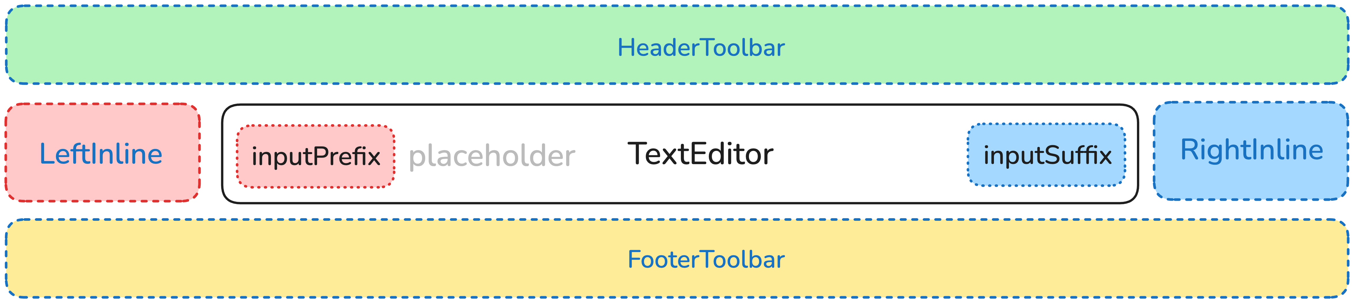
MessageInput Structure Diagram
Example 1: Input Prefix and Suffix
import { Chat, MessageInput } from '@tencentcloud/chat-uikit-react';function ChatWithInputPrefixSuffix() {// Input prefix: @ mention featureconst InputPrefix = () => (<buttonstyle={{border: 'none',background: 'transparent',color: '#1890ff',cursor: 'pointer'}}onClick={() => {// Trigger @ user selectionconsole.log('Open @ user selection');}}>@</button>);// Input suffix: Voice inputconst InputSuffix = () => (<buttonstyle={{border: 'none',background: 'transparent',cursor: 'pointer'}}onClick={() => {// Start voice inputconsole.log('Start voice input');}}>🎤</button>);return (<Chat><MessageInputslots={{inputPrefix: InputPrefix,inputSuffix: InputSuffix}}/></Chat>);}
The result is shown below:

Example 2: Custom Left and Right Toolbars
import { Chat, MessageInput } from '@tencentcloud/chat-uikit-react';function ChatWithCustomToolbars() {// Left toolbar: Only emoji and image buttonsconst LeftInline = () => (<div style={{ display: 'flex', gap: '8px' }}><button>😊</button><button>📷</button></div>);// Right toolbar: Custom send areaconst RightInline = () => (<div style={{ display: 'flex', alignItems: 'center', gap: '8px' }}><span style={{ fontSize: '12px', color: '#666' }}>Enter</span><buttonstyle={{padding: '6px 12px',background: '#1890ff',color: 'white',border: 'none',borderRadius: '4px',cursor: 'pointer'}}>Send</button></div>);return (<Chat><MessageInputslots={{leftInline: LeftInline,rightInline: RightInline}}/></Chat>);}
The result is shown below:

TextEditor
Type:
JSX.ElementOverrides the default text editor component. Default:
undefined.Example: Integrate a Custom Rich Text Editor
import { Chat, MessageInput, useChatContext } from '@tencentcloud/chat-uikit-react';// Custom rich text editorfunction RichTextEditor() {const { sendMessage } = useChatContext();const [inputValue, setInputValue] = useState('');const handleContentChange = (content: string) => {setInputValue(content);};const handleKeyDown = (e: React.KeyboardEvent) => {// Enter to send messageif (e.key === 'Enter') {// Trigger send logice.preventDefault();sendMessage({ type: 'textMessage', text: inputValue });// Clear the content of the editable divconst editableDiv = document.querySelector('.editable-div');if (editableDiv) {editableDiv.textContent = '';}}};return (<div style={{flex: 1,border: '1px solid #d9d9d9',borderRadius: '6px',padding: '8px 12px',minHeight: '32px',maxHeight: '120px',overflow: 'auto',}}><divcontentEditableclassName="editable-div"style={{outline: 'none',minHeight: '20px',lineHeight: '20px',}}onInput={(e) => {handleContentChange(e.currentTarget.textContent || '');}}onKeyDown={handleKeyDown}/></div>);}function ChatWithRichTextEditor() {return (<Chat><MessageInput TextEditor={<RichTextEditor />} /></Chat>);}
The result is shown below:

EmojiPicker
Type:
JSX.ElementOverrides the default emoji picker component. Default:
undefined.Example: Custom Emoji Picker
import { Chat, MessageInput, useChatUIState } from '@tencentcloud/chat-uikit-react';function CustomEmojiPicker() {const { insertInputContent } = useChatUIState();const emojiCategories = {Common: ['😀', '😂', '🥰', '😍', '🤔', '😭', '😡', '👍'],Gestures: ['👋', '🤝', '👏', '🙏', '✌️', '🤞', '🤟', '👌'],Animals: ['🐶', '🐱', '🐭', '🐹', '🐰', '🦊', '🐻', '🐼'],};const [activeCategory, setActiveCategory] = useState('Common');const [showPicker, setShowPicker] = useState(false);const insertEmoji = (emoji: string) => {insertInputContent(emoji);setShowPicker(false);};return (<div style={{ position: 'relative' }}><buttononClick={() => setShowPicker(!showPicker)}style={{ border: 'none', background: 'transparent', cursor: 'pointer' }}>😊</button>{showPicker && (<div style={{position: 'absolute',bottom: '100%',left: 0,background: 'white',border: '1px solid #ccc',borderRadius: '8px',padding: '12px',width: '280px',boxShadow: '0 4px 12px rgba(0,0,0,0.1)',}}>{/* Category tabs */}<div style={{ display: 'flex', marginBottom: '8px' }}>{Object.keys(emojiCategories).map(category => (<buttonkey={category}onClick={() => setActiveCategory(category)}style={{padding: '4px 8px',border: 'none',background: activeCategory === category ? '#1890ff' : 'transparent',color: activeCategory === category ? 'white' : '#666',borderRadius: '4px',cursor: 'pointer',fontSize: '12px',}}>{category}</button>))}</div>{/* Emoji grid */}<div style={{display: 'grid',gridTemplateColumns: 'repeat(8, 1fr)',gap: '4px',}}>{emojiCategories[activeCategory].map(emoji => (<buttonkey={emoji}onClick={() => insertEmoji(emoji)}style={{border: 'none',background: 'transparent',fontSize: '20px',cursor: 'pointer',padding: '4px',borderRadius: '4px',}}>{emoji}</button>))}</div></div>)}</div>);}function ChatWithCustomEmoji() {return (<Chat><MessageInput EmojiPicker={<CustomEmojiPicker />} /></Chat>);}
The result is shown below:

AttachmentPicker
Type:
JSX.ElementOverrides the default attachment picker component. Default:
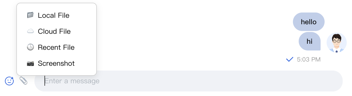
undefined.Example: Attachment Picker with Cloud Storage Integration
import { Chat, MessageInput } from '@tencentcloud/chat-uikit-react';// Attachment picker integrated with cloud storagefunction CloudAttachmentPicker() {const [showPicker, setShowPicker] = useState(false);const attachmentTypes = [{ key: 'local', label: 'Local File', icon: '📁' },{ key: 'cloud', label: 'Cloud File', icon: '☁️' },{ key: 'recent', label: 'Recent File', icon: '🕒' },{ key: 'screenshot', label: 'Screenshot', icon: '📷' }];const handleAttachmentSelect = async (type: string) => {switch (type) {case 'local':// Open local file pickerconst input = document.createElement('input');input.type = 'file';input.multiple = true;input.onchange = (e) => {const files = (e.target as HTMLInputElement).files;console.log('Selected local files:', files);};input.click();break;case 'cloud':// Open cloud file pickerconsole.log('Open cloud file picker');break;case 'recent':// Show recent filesconsole.log('Show recent files');break;case 'screenshot':// Start screenshotconsole.log('Start screenshot');break;}setShowPicker(false);};return (<div style={{ position: 'relative' }}><buttononClick={() => setShowPicker(!showPicker)}style={{ border: 'none', background: 'transparent', cursor: 'pointer' }}>📎</button>{showPicker && (<div style={{position: 'absolute',bottom: '100%',left: 0,background: 'white',border: '1px solid #ccc',borderRadius: '8px',padding: '8px',minWidth: '160px',boxShadow: '0 4px 12px rgba(0,0,0,0.1)'}}>{attachmentTypes.map(type => (<divkey={type.key}onClick={() => handleAttachmentSelect(type.key)}style={{display: 'flex',alignItems: 'center',gap: '8px',padding: '8px 12px',cursor: 'pointer',borderRadius: '4px',fontSize: '14px'}}><span>{type.icon}</span><span>{type.label}</span></div>))}</div>)}</div>);}function ChatWithCloudAttachment() {return (<Chat><MessageInput AttachmentPicker={<CloudAttachmentPicker />} /></Chat>);}
The result is shown below:
Summary
The MessageInput component delivers a comprehensive set of message input features and offers extensive customization options. By configuring props and leveraging the slot system, you can build input interfaces that meet your unique business needs. Choose the customization approach that best fits your scenario to provide an optimal user experience and high performance.
Ajuda e Suporte
Esta página foi útil?
Você também pode entrar em contato com a Equipe de vendas ou Enviar um tíquete em caso de ajuda.
comentários