tencent cloud

Tencent Cloud Agent Development Platform

Release Notes and Announcements
Release Notes
Product Announcement
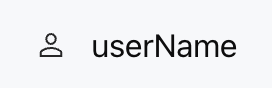
Product Introduction
Product Overview
Advantages
Use Cases
Model Introduction
Purchase Guide
Package Subscription
Previous Version
Getting Started
Agent Application and Its Three Modes
Creating a "Content Summary Assistant" in Standard Mode
Creating a “Webpage Scraping Assistant” in Single Workflow Mode
Creating a “Stand-up Comedy Content Creation Assistant” in Multi-Agent Mode
Operation Guide
Application Development
Workflow
Multi-Agent
Knowledge Base
Widget
Plugin Marketplace
Model List 
Prompt Templates
Application Templates
Platform Management
Business, Workspace and Permissions
API Documentation
History
API Category
Making API Requests
Atomic Capability APIs
Operation Optimization APIs
Document Library APIs
Q&A Database APIs
Knowledge Tag APIs
Application Management APIs
Enterprise Management APIs
Billing APIs
Release Management APIs
Dialogue Endpoint APIs
Data Statistics APIs
Data Types
Error Codes
Application API Documentation
Dialogue API Overview
Dialog API Documentation (WebSocket)
Dialog API Documentation (HTTP SSE)
Image Chat or File Chat (Real-time Document Parsing + Chat)
Offline Document Upload
Tencent Cloud Agent Development Platform Operation COS Guide
ADP Document Parsing Protocol
FAQs
Product FAQs
Technical FAQs
Related Agreements
Tencent Cloud Agent Development Platform Service Level Agreement
Tencent Cloud Agent Development Platform Service Specific Terms
Tencent Cloud Agent Development Platform Privacy Policy
Tencent Cloud Agent Development Platform Data Processing and Security Agreement
Open-Source License Statement
Lighthouse OpenClaw Connector Plugin Service Agreement
Contact Us
Glossary

Row

PDF
Mode fokus
Ukuran font
Terakhir diperbarui: 2026-02-03 15:37:25

Component Feature

Row is a horizontally laid out container and a shortcut for the Box component, with direction fixed as "row".
It is used to arrange child components horizontally and supports style configurations such as elastic layout, spacing, alignment, border, and background.

Basic Usage

Template example:
<Row gap="12px" align="center">
<Icon name="user" />
<Text value="userName" />
</Row>
Effect display as follows:


Attribute Description

All attributes are identical to the Box component, but the direction is fixed as "row".

Layout Property

Property Name
Type
Description
Default value
children
ChatKitComponent[]
Subcomponent List
-
align
Alignment
Alignment Mode for Intersect
-
justify
Justification
Alignment Mode for Main Axis
-
wrap
"nowrap" | "wrap" | "wrap-reverse"
Line Break Method
"nowrap"
flex
number | string
Flex value
-
gap
number | string
child element spacing
-
padding
number | string | Spacing
padding
-
border
number | Border | Borders
Border Configuration
-
background
string | ThemeColor
Background Color
-

Size Property

Property Name
Type
Description
Default value
height
number | string
height
-
width
number | string
width
-
size
number | string
Set both width and height at the same time
-
minHeight
number | string
minimum height
-
minWidth
number | string
minimum width
-
minSize
number | string
minimum size
-
maxHeight
number | string
max height
-
maxWidth
number | string
maximum width
-
maxSize
number | string
maximum size
-
aspectRatio
number | string
Aspect Ratio
-
radius
RadiusValue
rounded corners
-
margin
number | string | Spacing
margin
-
For detailed type definition, see Box.


Bantuan dan Dukungan

Apakah halaman ini membantu?

masukan