Release Notes
Product Announcement
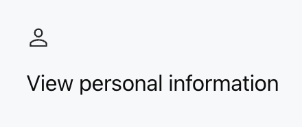
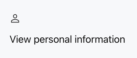
<ClickableonClickAction={{ type: "sys.go_to_url", payload: { url: "/profile" } }}padding="16px"radius="md"><Icon name="user" size="lg" /><Text value="View personal information" /></Clickable>
Property Name | Type | Description | Default value |
onClickAction | ActionConfig | Trigger the click action. | - |
disabled | boolean | Whether to disable the component (after it is disabled, it will not respond to click and the cursor displays as not-allowed) | false |
Property Name | Type | Description | Default value |
direction | "row" | "col" | layout direction | "row" |
children | ChatKitComponent[] | Subcomponent List | - |
align | Alignment | Intersect Alignment Mode | - |
justify | Justification | Main Axis Alignment Mode | - |
wrap | "nowrap" | "wrap" | "wrap-reverse" | Line Break Method | "nowrap" |
flex | number | string | Flex value | - |
gap | number | string | child element spacing | - |
padding | number | string | Spacing | padding | - |
border | number | Border | Borders | Border Configuration | - |
background | string | ThemeColor | Background Color | - |
Property Name | Type | Description | Default value |
height | number | string | height | - |
width | number | string | width | - |
size | number | string | Set both width and height at the same time | - |
minHeight | number | string | minimum height | - |
minWidth | number | string | minimum width | - |
minSize | number | string | minimum size | - |
maxHeight | number | string | max height | - |
maxWidth | number | string | maximum width | - |
maxSize | number | string | Maximum Size | - |
aspectRatio | number | string | Aspect Ratio | - |
radius | RadiusValue | rounded corners | - |
margin | number | string | Spacing | margin | - |
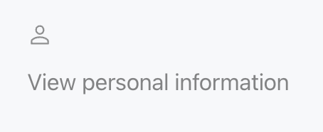
disabled is set to true, Clickable component enters non-interactive status.not-allowed disable status.onClickAction.disabled attribute (such as Button, Input, Checkbox) will be automatically disabled.<Clickable disabled={true}onClickAction={{ type: "sys.go_to_url", payload: { url: "/profile" } }}padding="16px"radius="md"><Icon name="user" size="lg" /><Text value="View personal information" /></Clickable>
Default Effect | disabledIs Set totrueEffect |
 |  |
disable() method to disable the entire Widget, if the Clickable component has alwaysEnabled: true in its onClickAction medium configuration, the Clickable component will not be disabled.<CardasForm={true}confirm={{ label: "Submit", action: { type: "form.submit" } }}><Input name="username" required={true} /><Input name="email" required={true} /><ClickableonClickAction={{type: "dialog.close",alwaysEnabled: true}}><Button label="Cancel" color="secondary" /></Clickable></Card>
disable() to disable the entire form:<ClickableonClickAction={{type: "help.show",alwaysEnabled: true}}><Icon name="circle-question" /><Text value="Need help?" /></Clickable>
alwaysEnabled is only applicable to the disabled status transmitted through the disable() method of the parent component.disabled: true directly on Clickable, the component will still be disabled.alwaysEnabled, and Clickable and its child components will not be disabled by the parent component.Apakah halaman ini membantu?
Anda juga dapat Menghubungi Penjualan atau Mengirimkan Tiket untuk meminta bantuan.
masukan