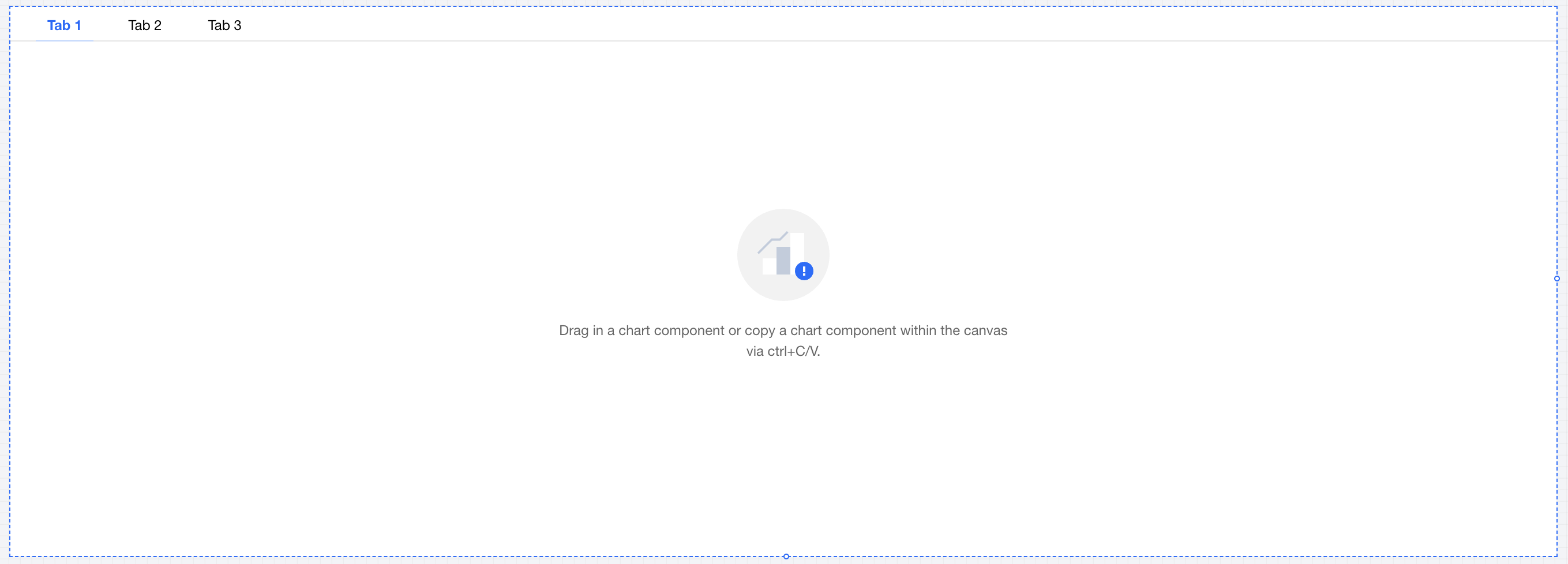
Product Overview
Strengths
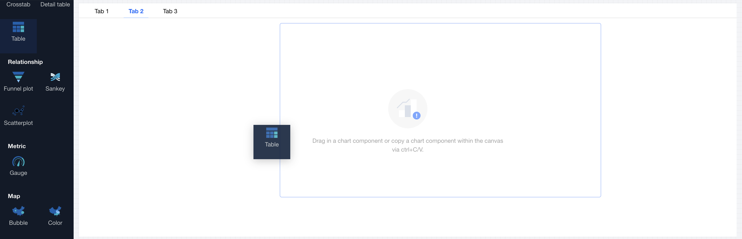
Product Features
Use Cases
Set category | Setting Item | Setup Instructions |
tag item | tag item name | Display name of the tag item |
| tag item sort | Click the up and down arrows on the left side to sort tag items. |
| Adding a Tag | Click to add a tag item, supporting up to 10 tag items |
| Delete tags. | Click the delete icon on the right to remove a tag item, with a minimum of 1 tag item reserved. |
Tag style | tag alignment | Set tag alignment mode, offering three types to select: 1. Left 2. Center 3. Right |
| tag format | Set tag display form, offering two types to select: 1. Text type 2. Button type |
| decimal places retained | Set the number of decimal places for numeric values. For example, "1211.2334" with 2 decimal places retained will show as "1211.23". |
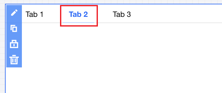
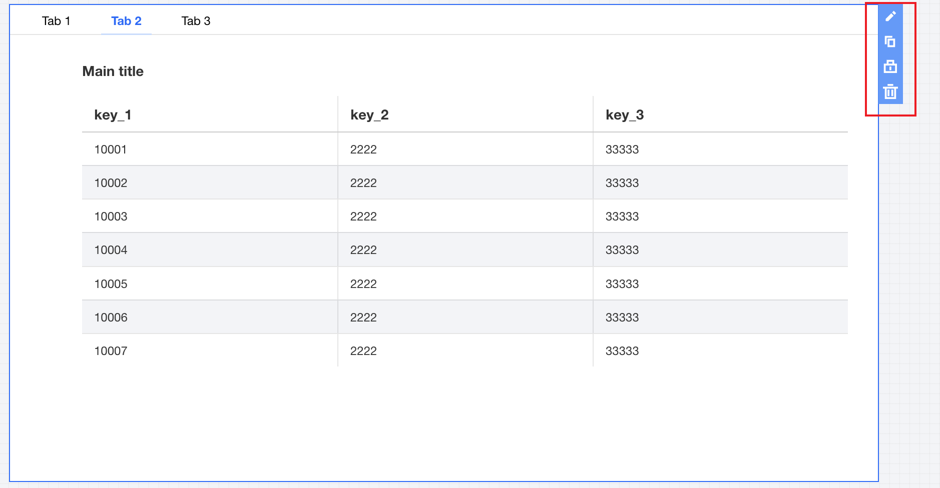
Title | Display | Turn on/off display tab Title |
| Title | Show tab component title name |
Was this page helpful?
You can also Contact sales or Submit a Ticket for help.
Help us improve! Rate your documentation experience in 5 mins.
Feedback