제품 개요
Basic Concepts
응용 시나리오
기능 소개
계정 시스템
사용자 정보 및 관계망
메시지 관리
그룹 시스템
Official Account
Audio/Video Call
사용 제한
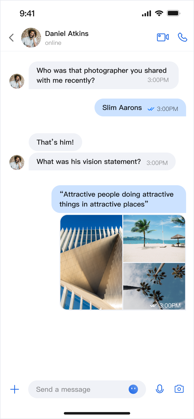
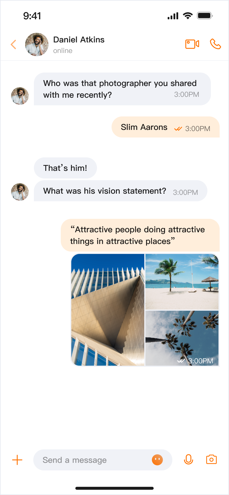
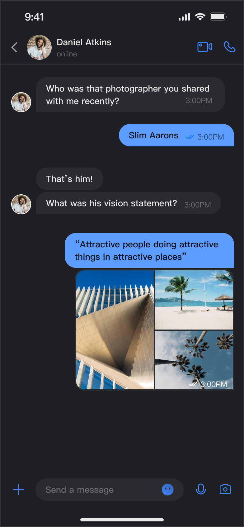
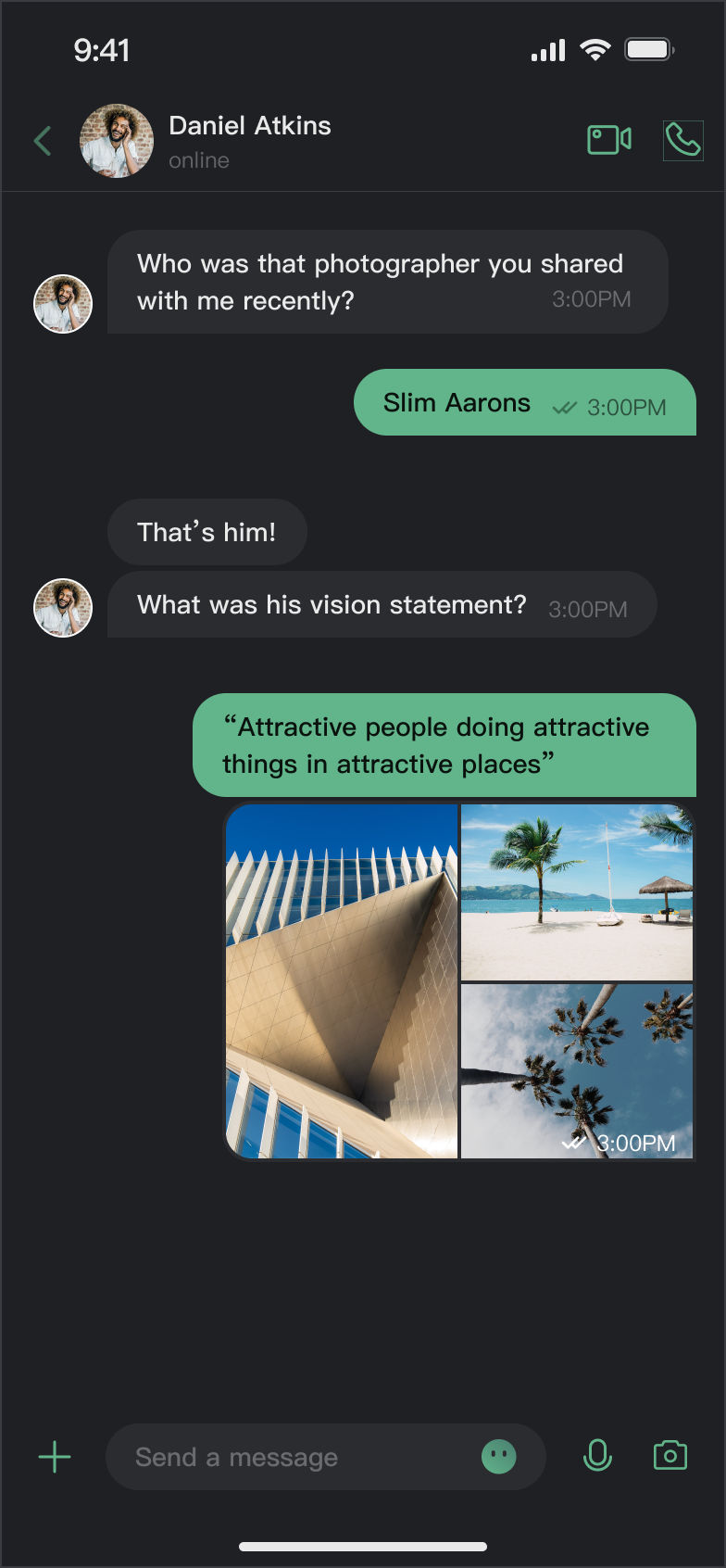
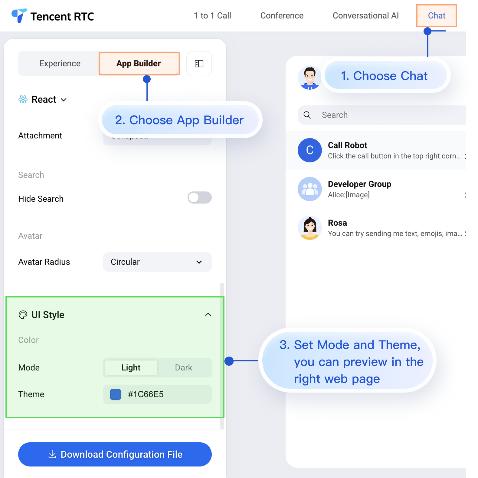
Light + Default Color | Light + Orange | Dark + Default Color | Dark + Green Theme |
 |  |  |  |
ThemeState.Method | Parameter | Return Value | Description |
setThemeMode(_:) | ThemeMode | Void | Sets the theme mode, automatically saves and refreshes. ThemeMode.system: Follows system appearance. ThemeMode.light: Forces light mode. ThemeMode.dark: Forces dark mode. |
Method | Parameter | Return Value | Description |
setPrimaryColor(_:) | String | Void | Sets the primary color. Accepts Hex format (e.g., "#1C66E5"). |
clearPrimaryColor() | None | Void | Removes the custom primary color and restores the default blue. |
setThemeMode or setPrimaryColor, the configuration is automatically saved to UserDefaults. No manual saving is required. The settings will be loaded automatically when the app restarts.Property | Type | Description |
currentMode | ThemeMode | Current theme mode. |
currentPrimaryColor | String? | Current primary color (Hex format). |
hasCustomPrimaryColor | Bool | Whether a custom primary color is set. |
isDarkMode | Bool | True if the current mode is dark mode. |

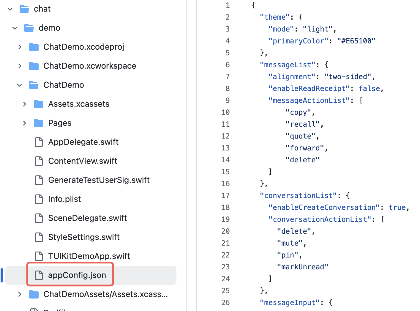
appConfig.json file looks like this. The configuration options match those on the AppBuilder page. Appearance settings are under theme:{"theme": {"mode": "light", // Theme mode: light - Light mode, dark - Dark mode, system - Follows system"primaryColor": "#E65100" // Primary color, 6-digit hex value},"messageList": {"alignment": "two-sided","enableReadReceipt": false,"messageActionList": ["copy","recall","quote","forward","delete"]},"conversationList": {"enableCreateConversation": true,"conversationActionList": ["delete","mute","pin","markUnread"]},"messageInput": {"hideSendButton": false,"attachmentPickerMode": "collapsed"},"search": {"hideSearch": false},"avatar": {"shape": "circular"}}
Parameter | Type | Optional Values | Description |
mode | String | "system", "light", "dark" | Theme mode. |
primaryColor | String | Hex color value, e.g. "#0ABF77" | Primary color. |
import AtomicX@mainstruct MyApp: App {init() {// Load theme configuration fileif let path = Bundle.main.path(forResource: "appConfig", ofType: "json") {AppBuilderHelper.setJsonPath(path: path)}}var body: some Scene {WindowGroup {ContentView()// Inject ThemeState.shared at the root view of the app.environmentObject(ThemeState.shared)}}}
setThemeMode API. themeState is the ThemeState.shared singleton object accessed from the environment. Example:import SwiftUIimport AtomicXstruct SettingsView: View {@EnvironmentObject var themeState: ThemeStatevar body: some View {List {Section("Appearance Mode") {Button("Follow System") {themeState.setThemeMode(.system)}Button("Light Mode") {themeState.setThemeMode(.light)}Button("Dark Mode") {themeState.setThemeMode(.dark)}}}.navigationTitle("Settings")}}
setPrimaryColor API. Just provide a Hex color value, and all TUIKit SwiftUI components will automatically adapt matching colors for different UI elements—no manual adjustments needed. Example:struct CustomColorPicker: View {@EnvironmentObject var themeState: ThemeState@State private var customColor = "#1C66E5"var body: some View {VStack(spacing: 20) {TextField("Enter color value", text: $customColor).textFieldStyle(RoundedBorderTextFieldStyle()).placeholder(when: customColor.isEmpty) {Text("#1C66E5").foregroundColor(.gray)}Button("Apply Primary Color") {themeState.setPrimaryColor(customColor)}.disabled(!isValidHexColor(customColor))}.padding()}private func isValidHexColor(_ hex: String) -> Bool {let pattern = "^#[0-9A-Fa-f]{6}$"return hex.range(of: pattern, options: .regularExpression) != nil}}
themeState.colors throughout your app to keep the appearance consistent when switching themes.if themeState.isDarkMode {// Currently in dark mode} else {// Currently in light mode}
ThemeState is an ObservableObject. Make sure your views use @EnvironmentObject or @ObservedObject to observe changes..opacity() modifier with your color.themeState.clearPrimaryColor() // Remove custom primary colorthemeState.setThemeMode(.system) // Switch to system mode
UserDefaults under the key "BaseComponentThemeKey". The configuration is removed when the app is uninstalled and resets to default after reinstalling.let config = themeState.currentThemeprint("Mode: \\(config.mode)")print("Primary Color: \\(config.primaryColor ?? "Default")")
themeState.setThemeMode(.dark)themeState.setPrimaryColor("#0ABF77")
피드백